Katherine Chen's Portfolio

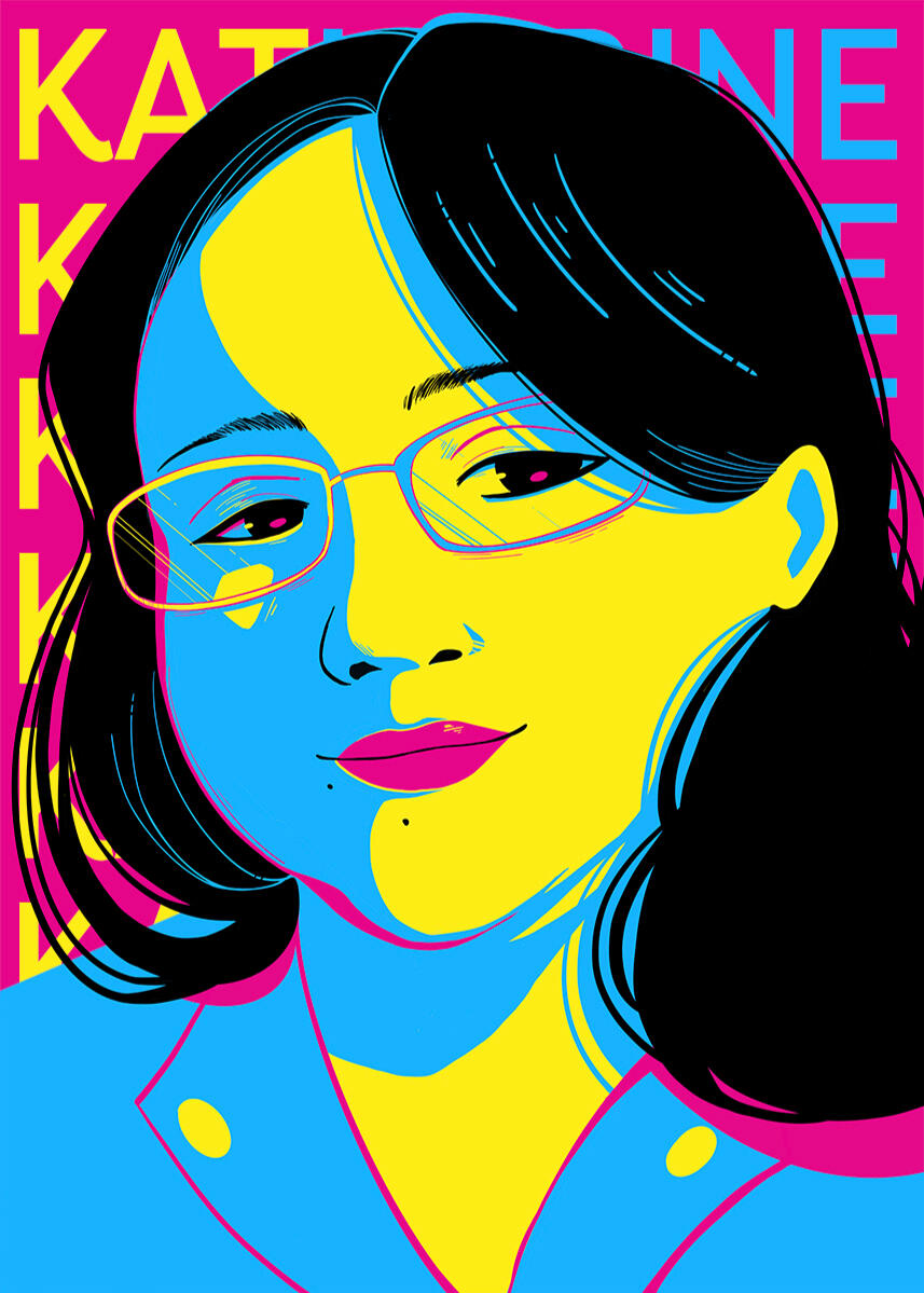
Hello, my name is Katherine Chen, and I am a Chinese-American graphic designer, illustrator, and frontend web designer currently located in Florida. I am extremely bad at CAPTCHA, so I may actually be a T-1000.I have had a passion for digital illustration and design since Neopets days, and have since worked in the design field for almost a decade creating marketing materials, brand guides, various art prints, apparel design, and more for non-profits, businesses, schools and districts, and private clients. I have worked as a freelance digital illustrator since my college years living in a dorm room, and I recently held a position as the lead frontend web designer and graphic designer and worked with educational institutions across the United States.I enjoy doing volunteer work and participating in charitable fundraisers and art challenges, and I love streaming art and being bad at games on Twitch. I also have a banana morph Ball Python named Ruoye (若邪) who is unfortunately an escape artist if I'm not careful.If you would like to contact me, please email me at [email protected].Download CV - Google Drive

Graphic Design

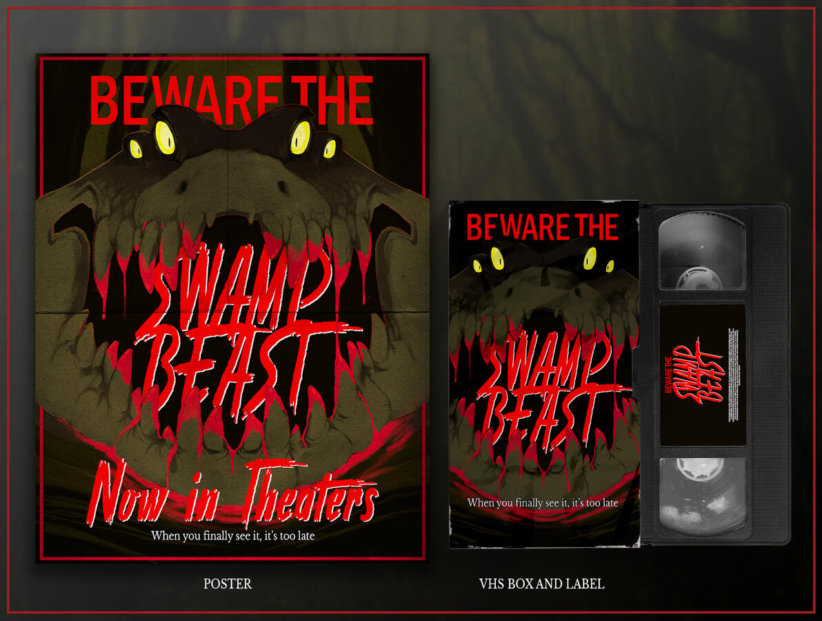
These are various examples of design work that I created in recent years. The main programs I use for my design work are Adobe Illustrator, Adobe InDesign, Adobe Photoshop, and good old pencil and paper. For any illustration work involved, I use Procreate on a Generation 1 Apple iPad pro.

Web Design/UI Design

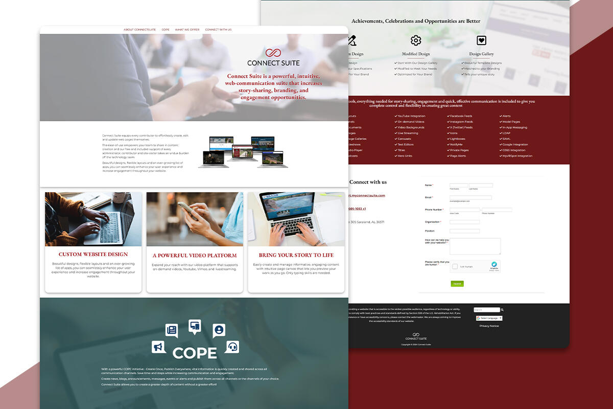
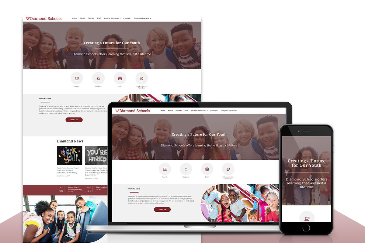
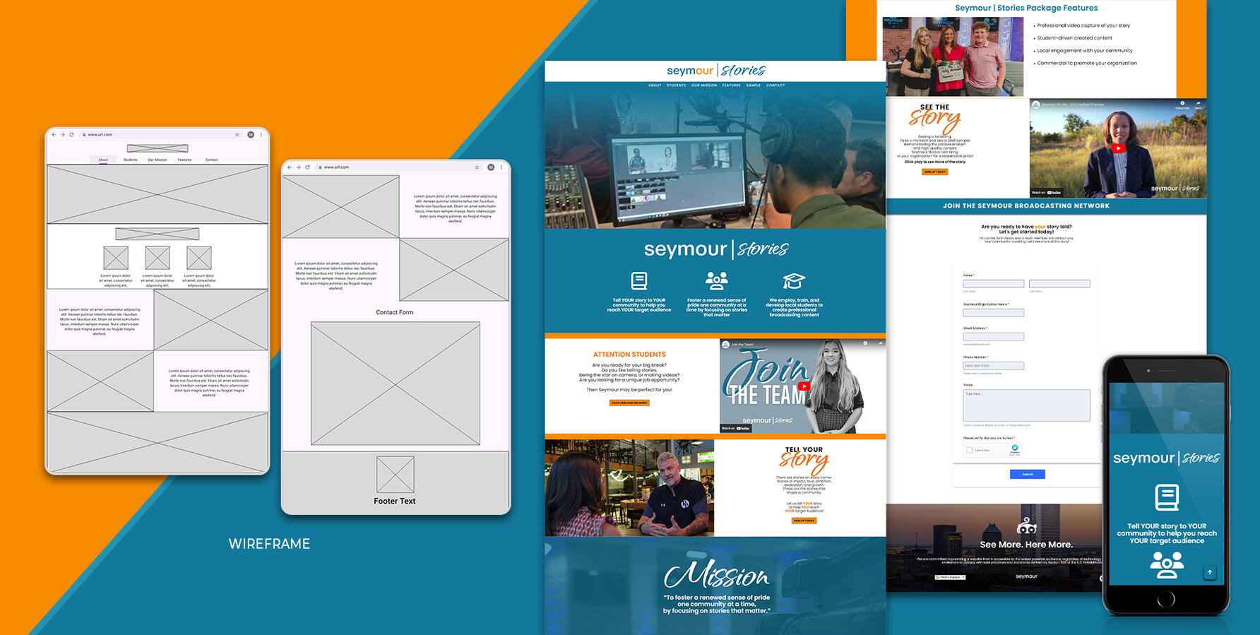
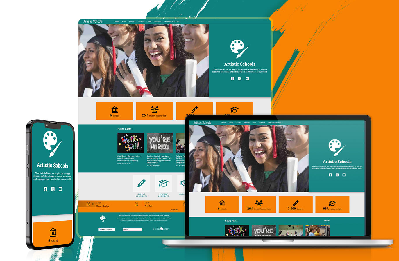
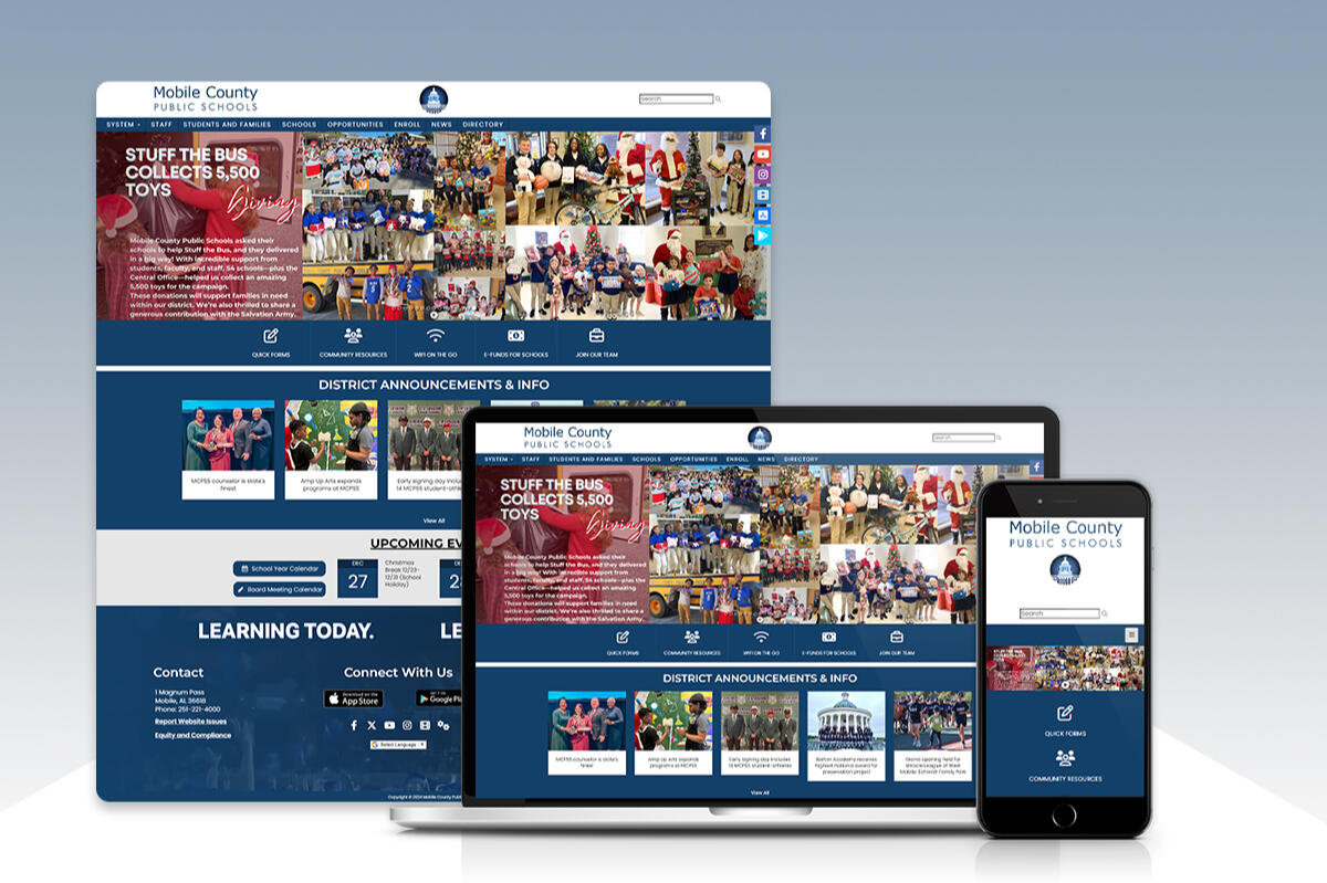
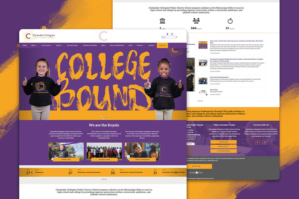
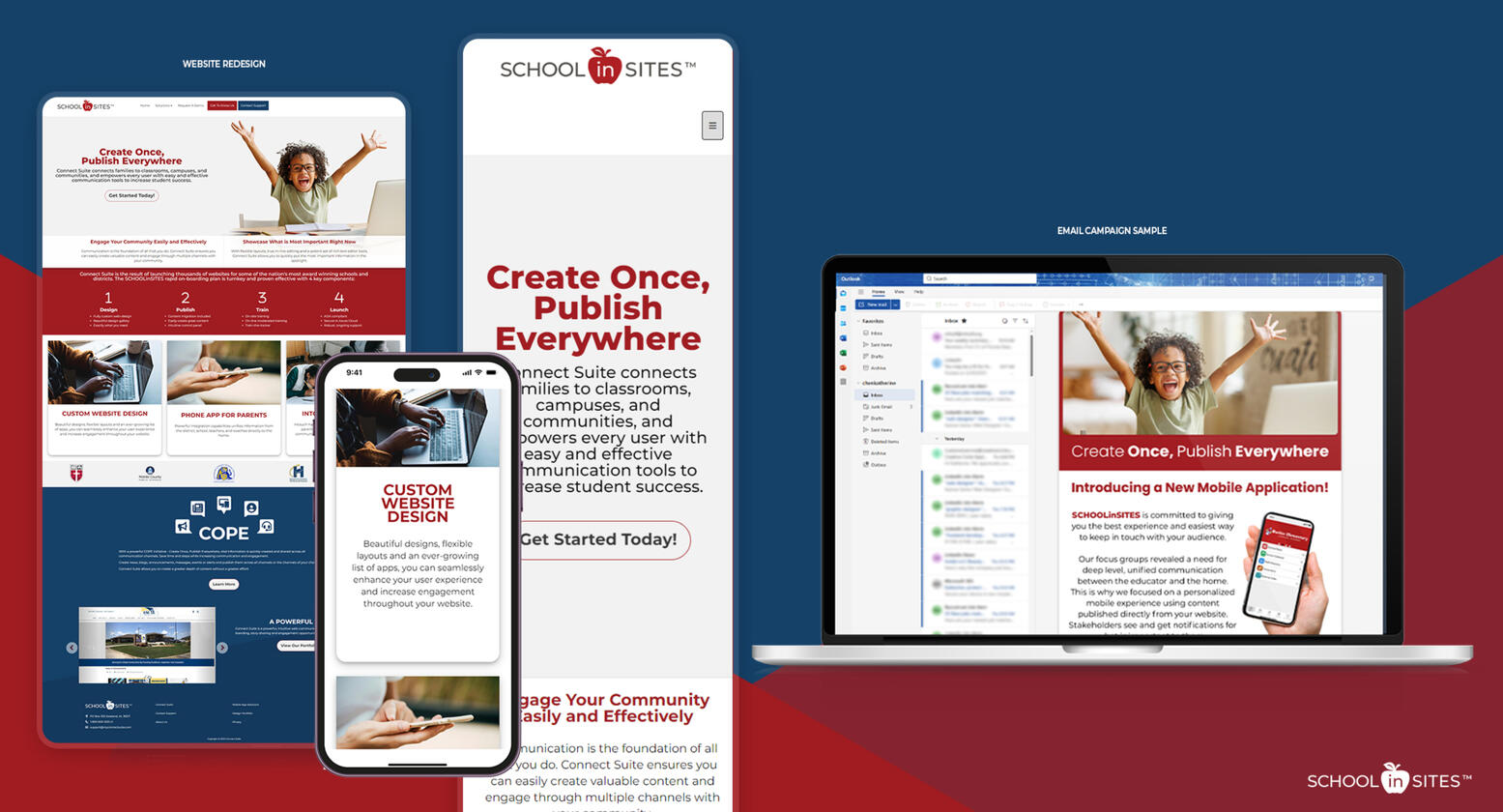
Frontend web design work I did during my time at ConnectSuite/SCHOOLinSITES. Since most of our clients were schools and school districts, all website templates that I created were made according to feedback from district/school administration, and also made to be easy to navigate for students and parents. All examples were created using the ConnectSuite CMS program and furthered customized using HTML, CSS, and JavaScript. Websites made using ConnectSuite are ADA compliant and mobile friendly. View the updated SCHOOLinSITES template library.

Illustrations

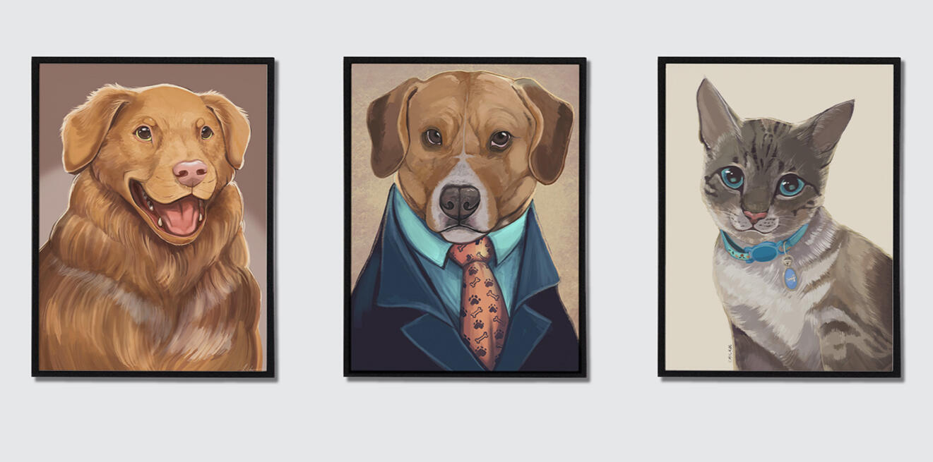
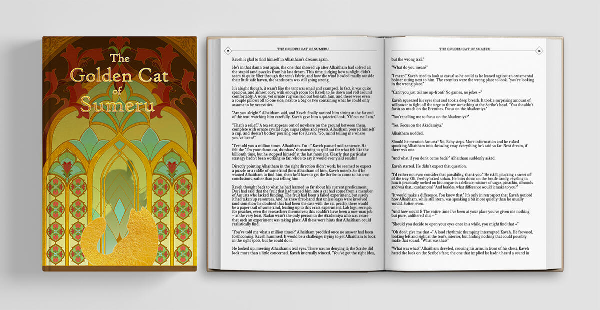
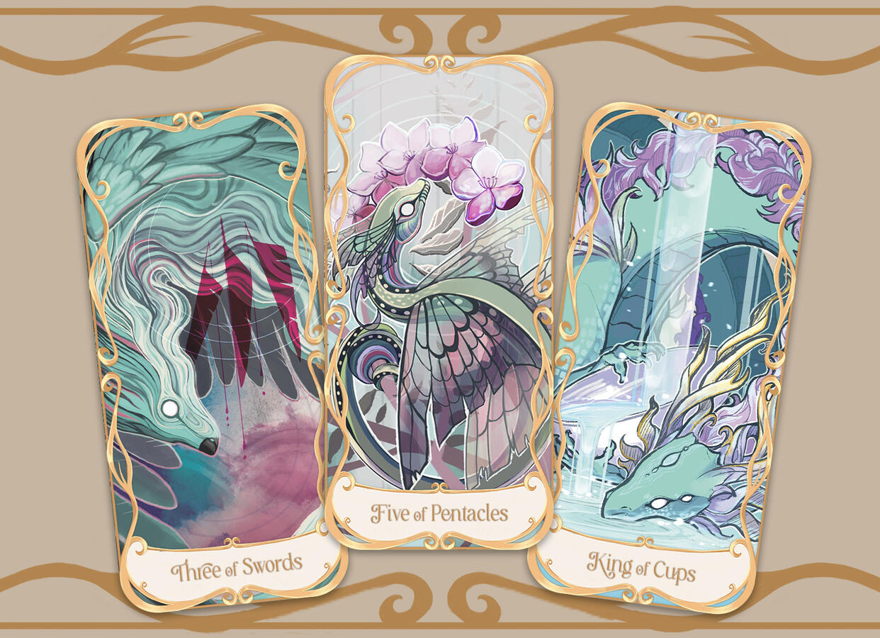
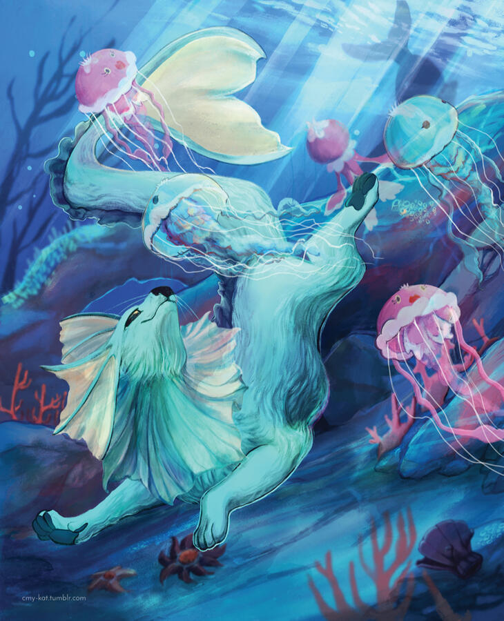
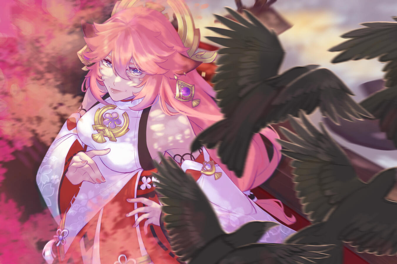
Examples of illustrations that I have done for client and personal use. I regularly take commissions from clients and work to foster a positive and ongoing relationship to create the best quality work based off of their requests. The programs I use for my illustrations are Procreate and Adobe Photoshop CC. I use a Generation 1 Apple iPad Pro and Apple Pencil.

Motion Design Reel

Examples of some basic video editing and motion design that I have created. I have been learning how to animate and video edit through tutorials and advice from far more experienced peers. The programs I use are Adobe Premiere Pro, Adobe After Effects, and CapCut.

Example Reel

CMYKat Brand

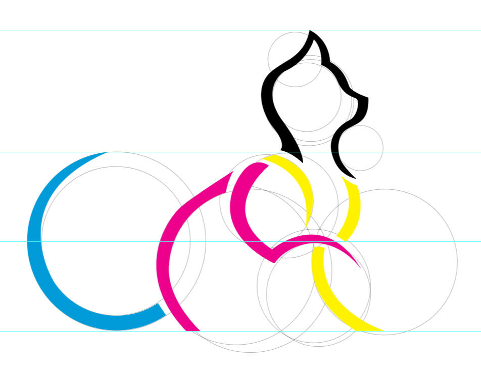
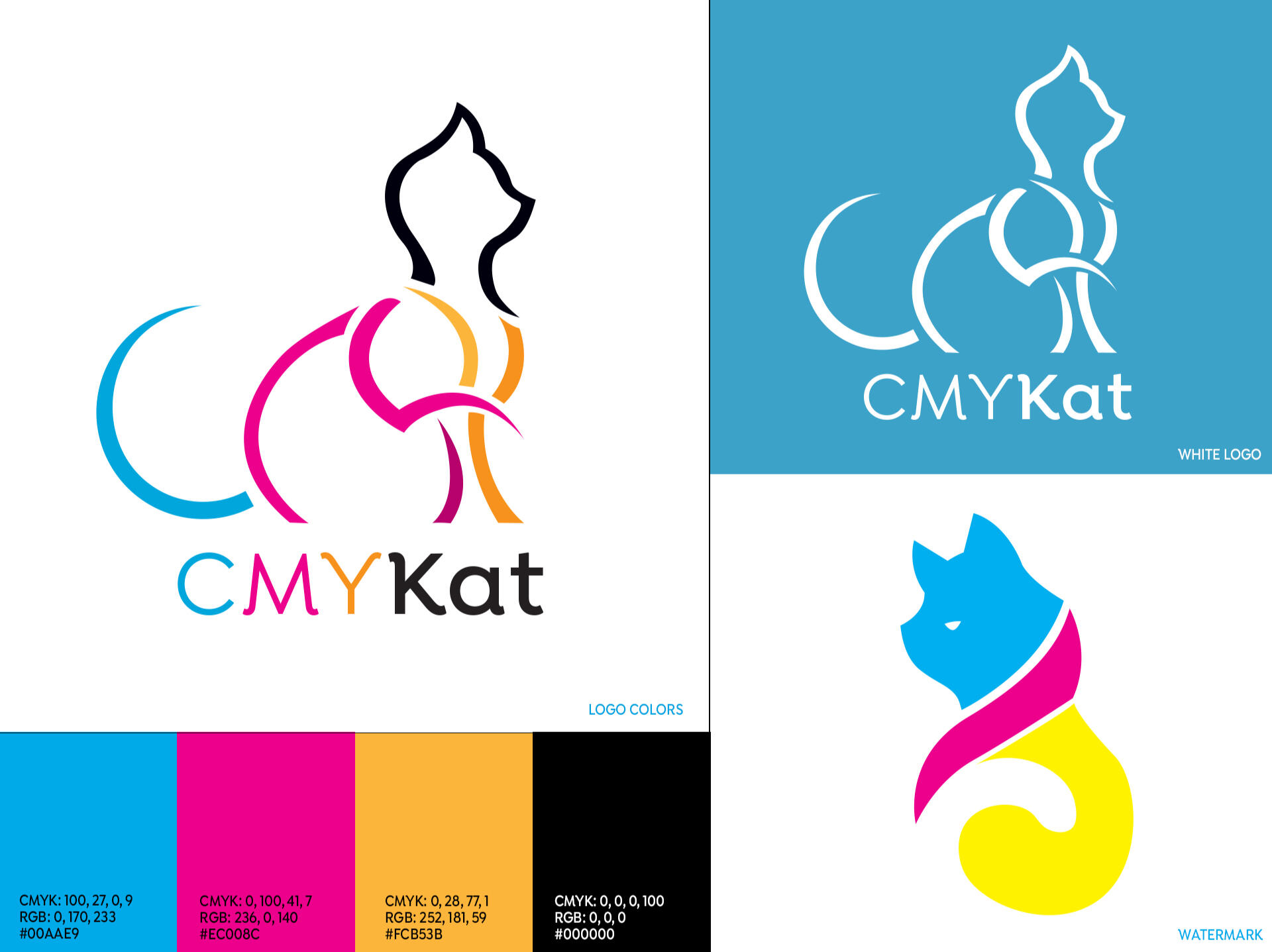
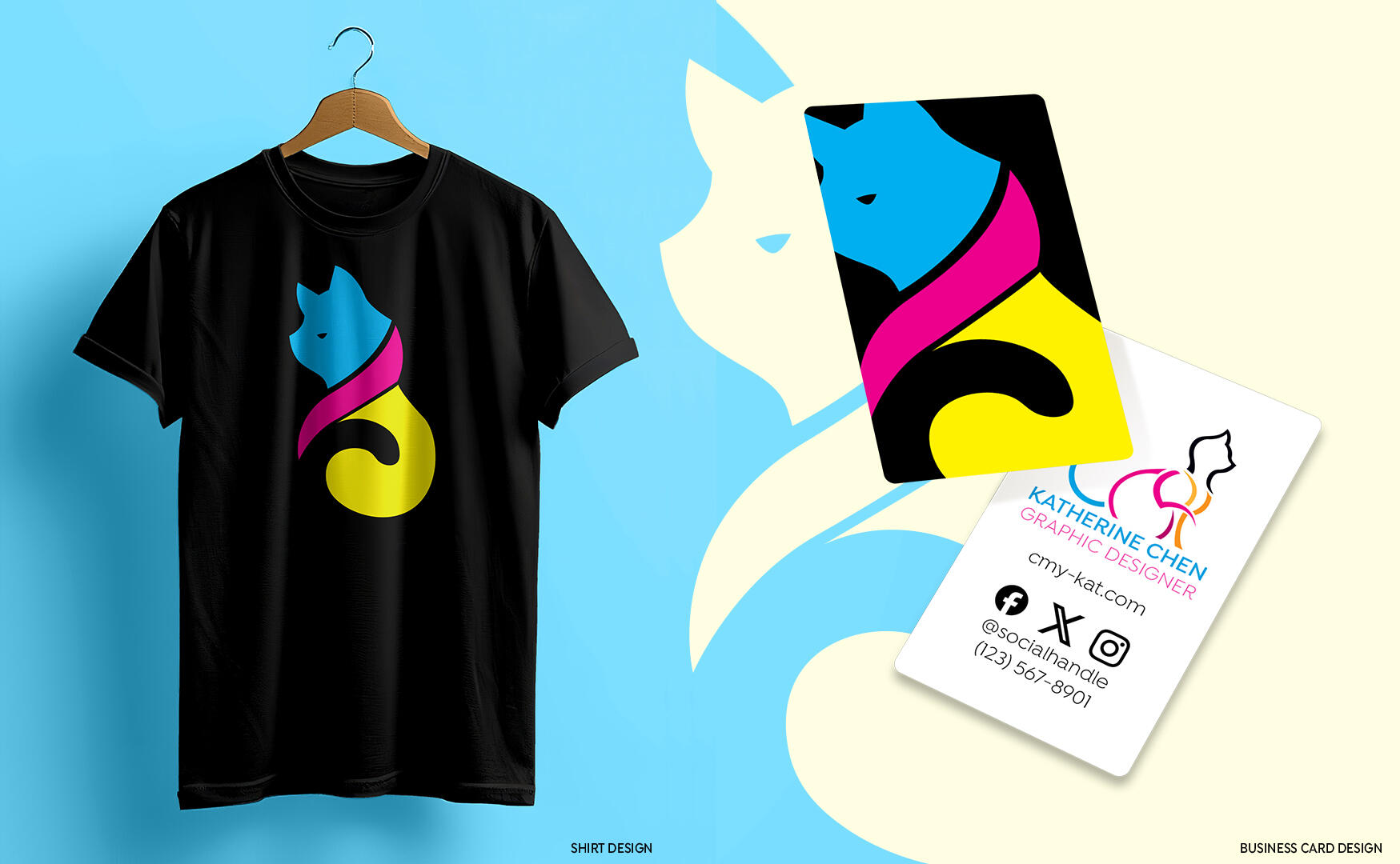
The objective of this project was to create a brand for myself so that I had a “stamp” for my art and designs. I wanted to create a design that was uniquely “me” but also my profession as a graphic designer. After a few iterations from when I had called my brand “Kat Creations”, I decided to utilize my nickname (Kat) and combined it with the print colors CMYK to make CMYKat. I now use this logo to advertise my services and as a signature for my illustrations and projects.

Animated CMYKat Logo

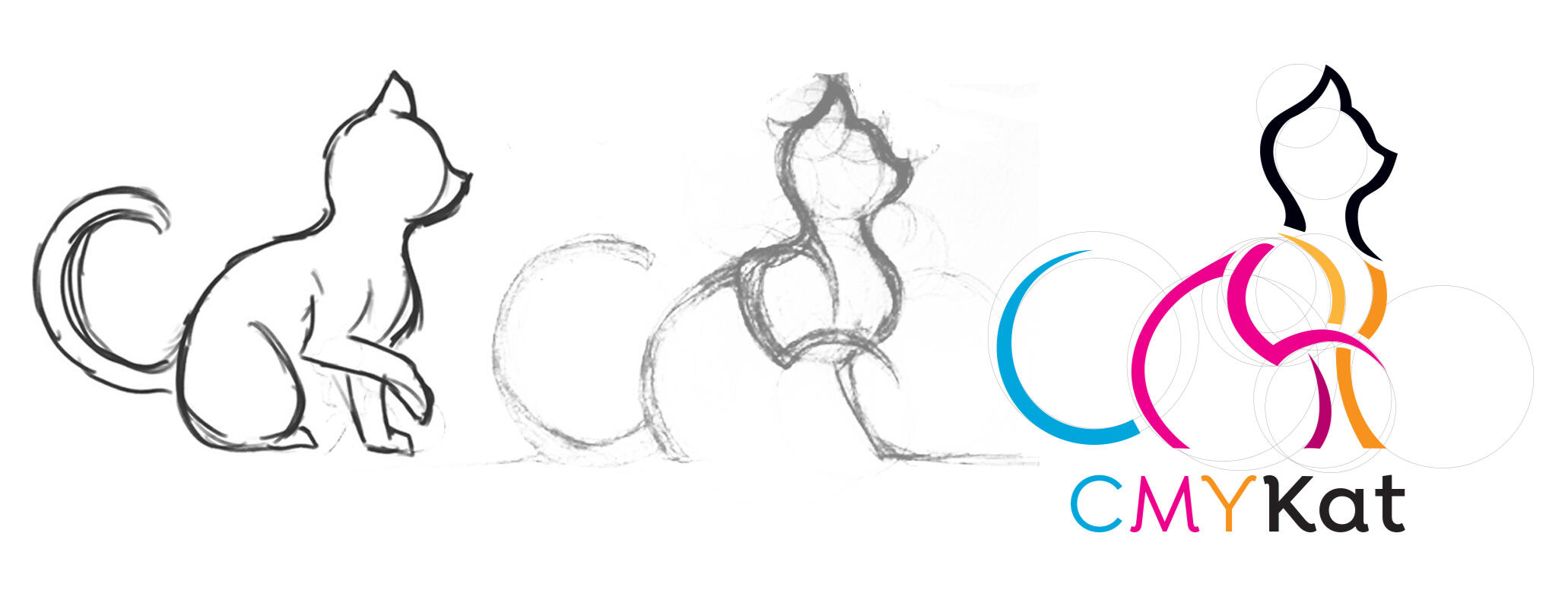
Sketches and Concepts

I sketched out a cat shape, then separated the shape so it spelled out CMY along with the corresponding colors (cyan, magenta, yellow) with the K being the head of the cat in black. I used a slightly more orange-yellow for the "Y" due to visibility issues, then used a darker shades on some of the lines to create some form of depth in the logo. Along with the logo, I designed a cat watermark to use for any marketing materials I may design.
SCHOOLinSITES Marketing Materials

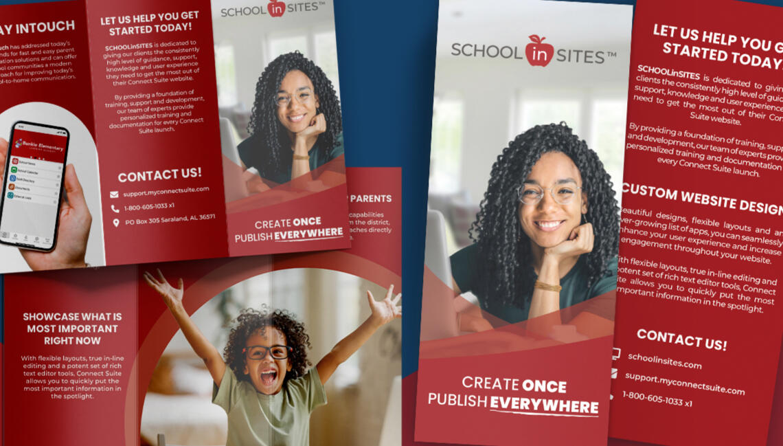
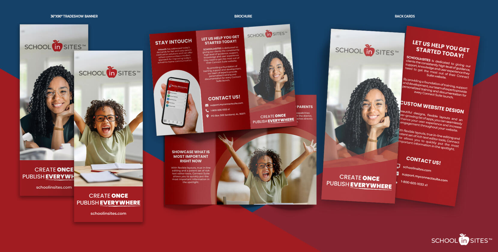
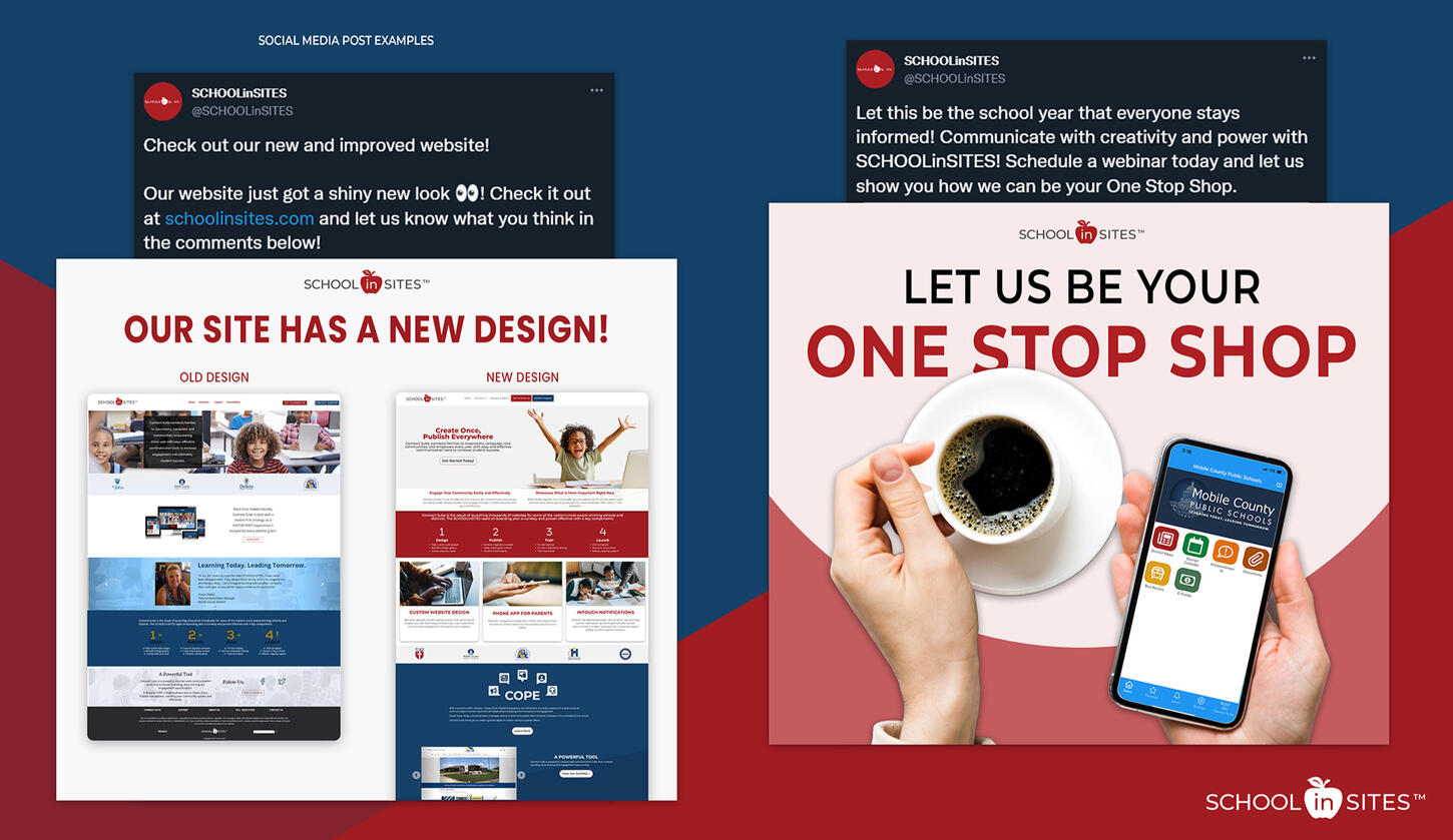
During my role at ConnectSuite/SCHOOLinSITES, I created a number of marketing materials to help advertise our CMS platform to schools, districts, and to be displayed at tradeshows. I was also assigned the task of redesigning the main SCHOOLinSITES website. The marketing materials are meant to be cohesive and on-brand with the website, which you can preview live. The information on the website was updated with better and more descriptive verbiage, while the website appearance and layout was revamped to be more modernized, easier to navigate, and eye-catching to visitors.
Animated CMYKat Logo

Lotus Spa

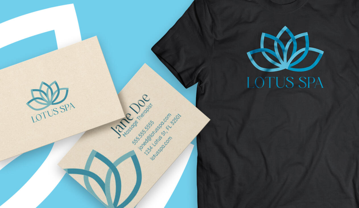
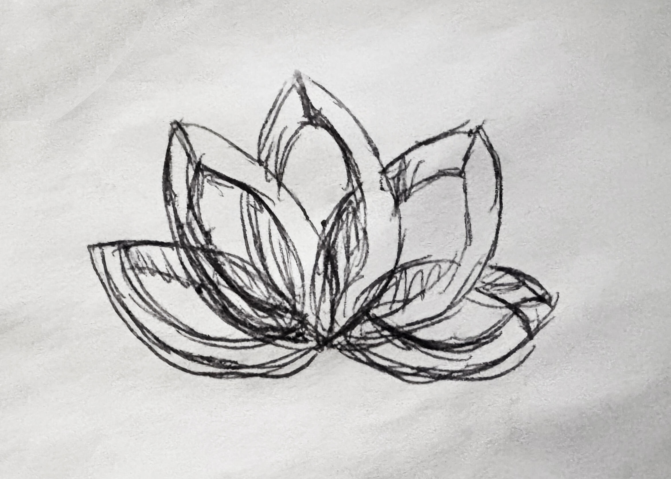
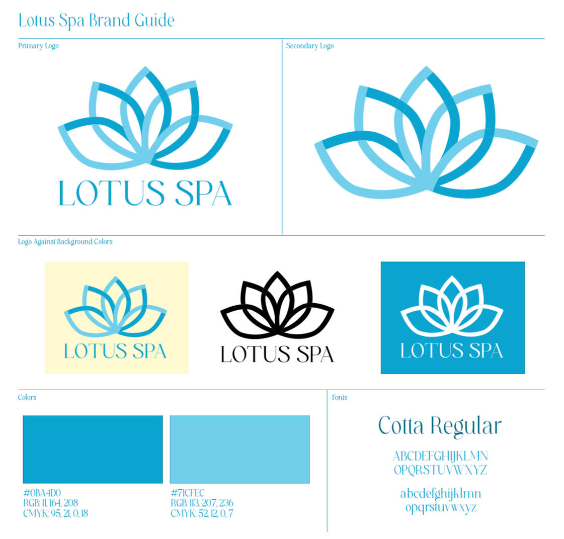
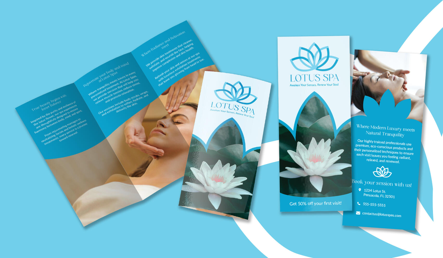
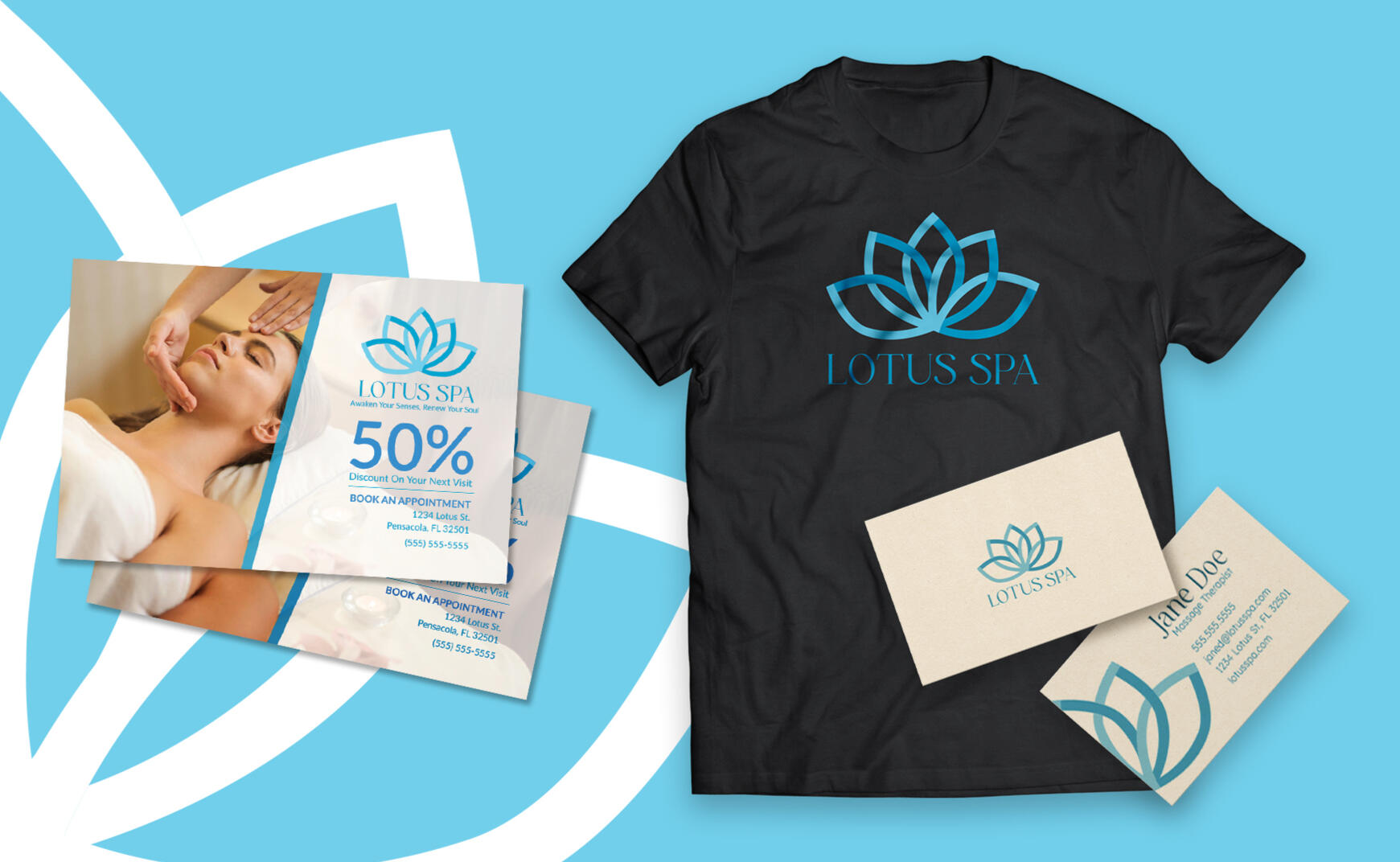
Originally, this logo was created as a personal project for my Twitch streams before I decided to go a different direction. While this logo is no longer used in that capacity, I decided to recycle it to use for a spa brand. I wanted to create almost an optical illusion with the logo using the overlapping petals. For the brand, I wanted to design a cohesive and elegant brand guide that communicated the calm, natural, and luxurious services that spas provide.

Animated CMYKat Logo

Website Design

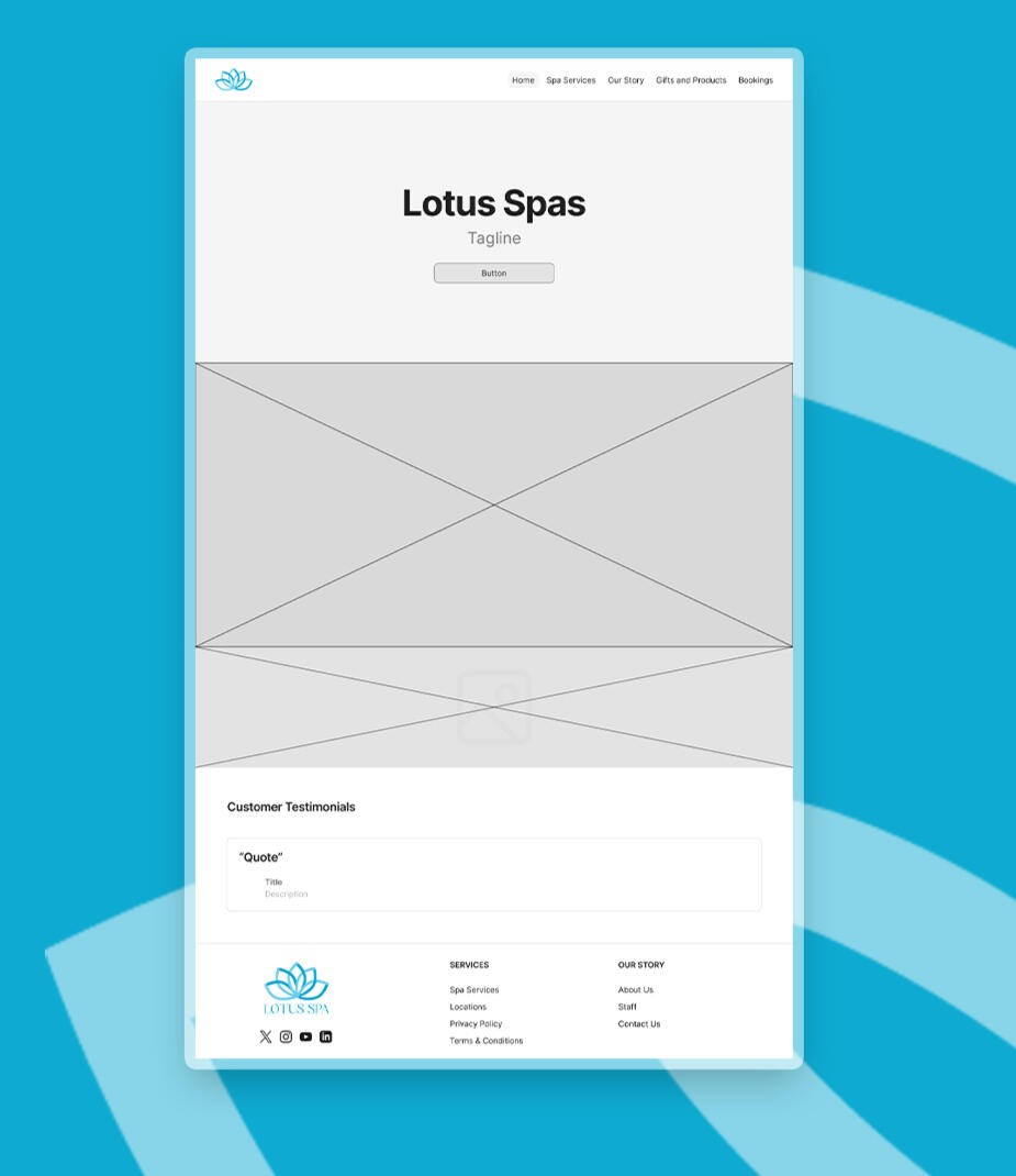
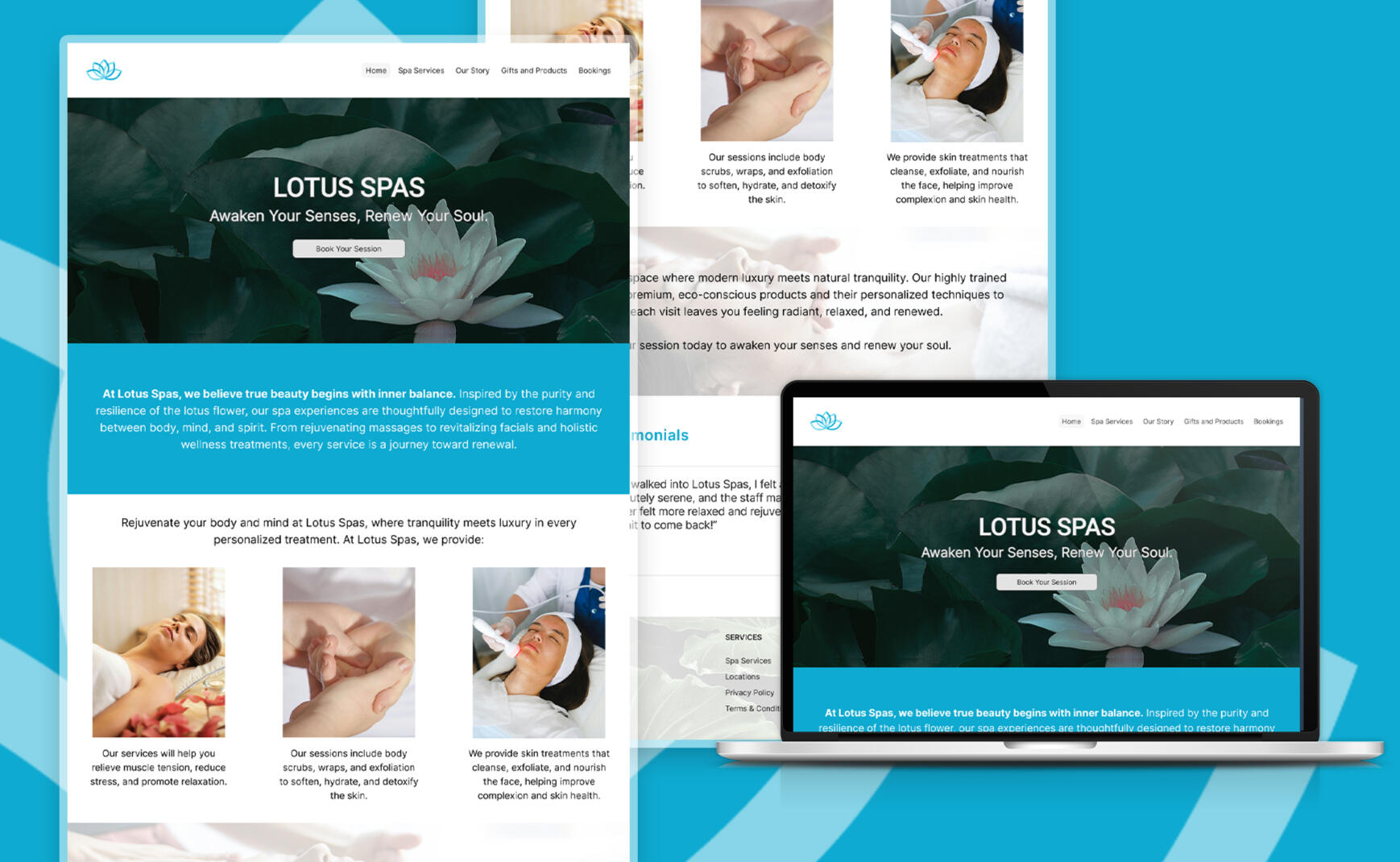
The Lotus Spa website uses mostly neutral tones and images to reflect the brand's focus on elegance and holistic wellness. Since the lotus is the main theme of the brand, I used mostly photos of the flower for the background images. The website design is also meant to be easy to navigate and visually simple to visitors. The key features of the front page are the brief mission description and the customer reviews/testimonials slideshow.

Askalotl Brand Guide

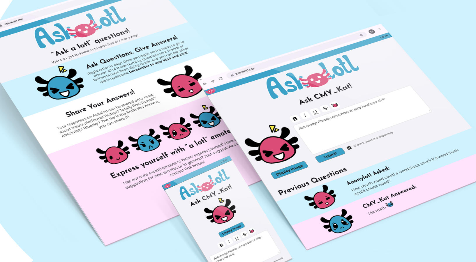
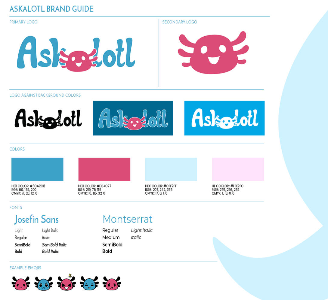
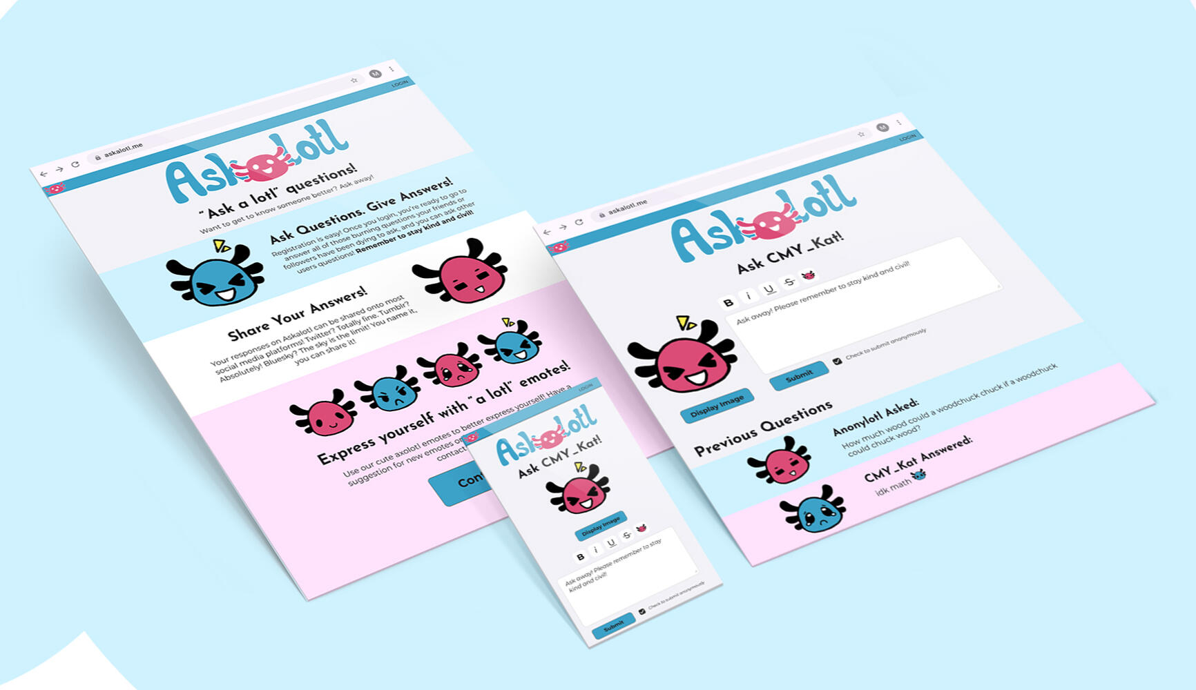
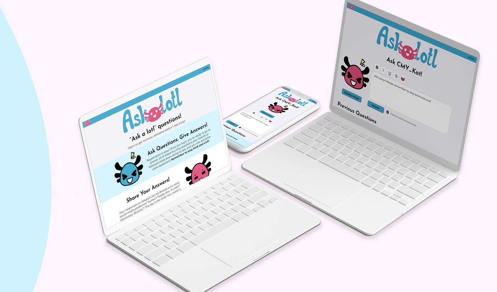
A voluntary project headed by a developer friend, Askalotl was meant to be a social media platform where users could ask or answer questions, similar to the now defunct CuriousCat and Retrospring. Though the project was scrapped, Askalotl was an incredibly fun project to collaborate on and a huge honor to be a part of.

Axalotl Animated Logo

Concepts

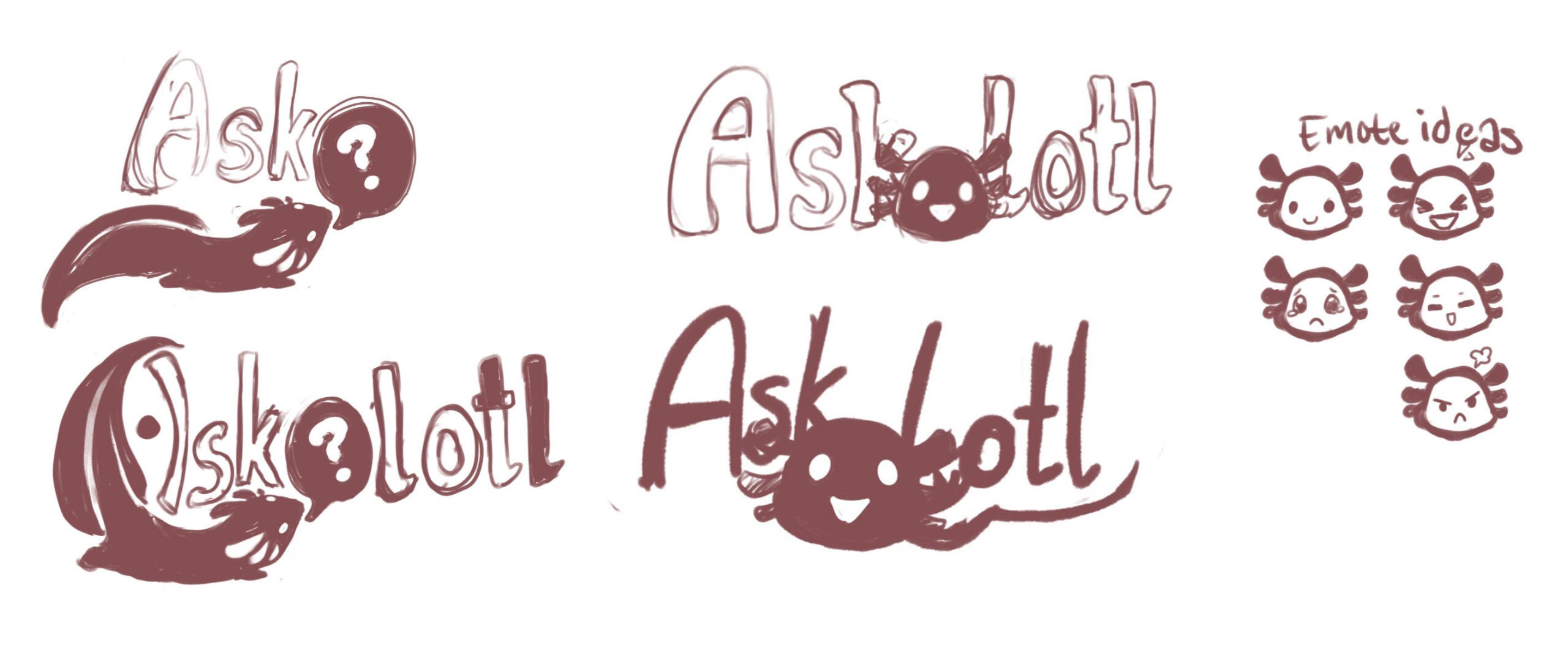
For the Askalotl logo, I sketched a few concepts that were meant to reflect the 'curiosity' of asking questions and felt playful and welcoming. The concept that was chosen made the branding more cohesive with the digital content that I had also sketched out such as emotes and iconography.

Bee's Knees Packaging Design

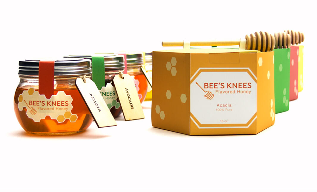
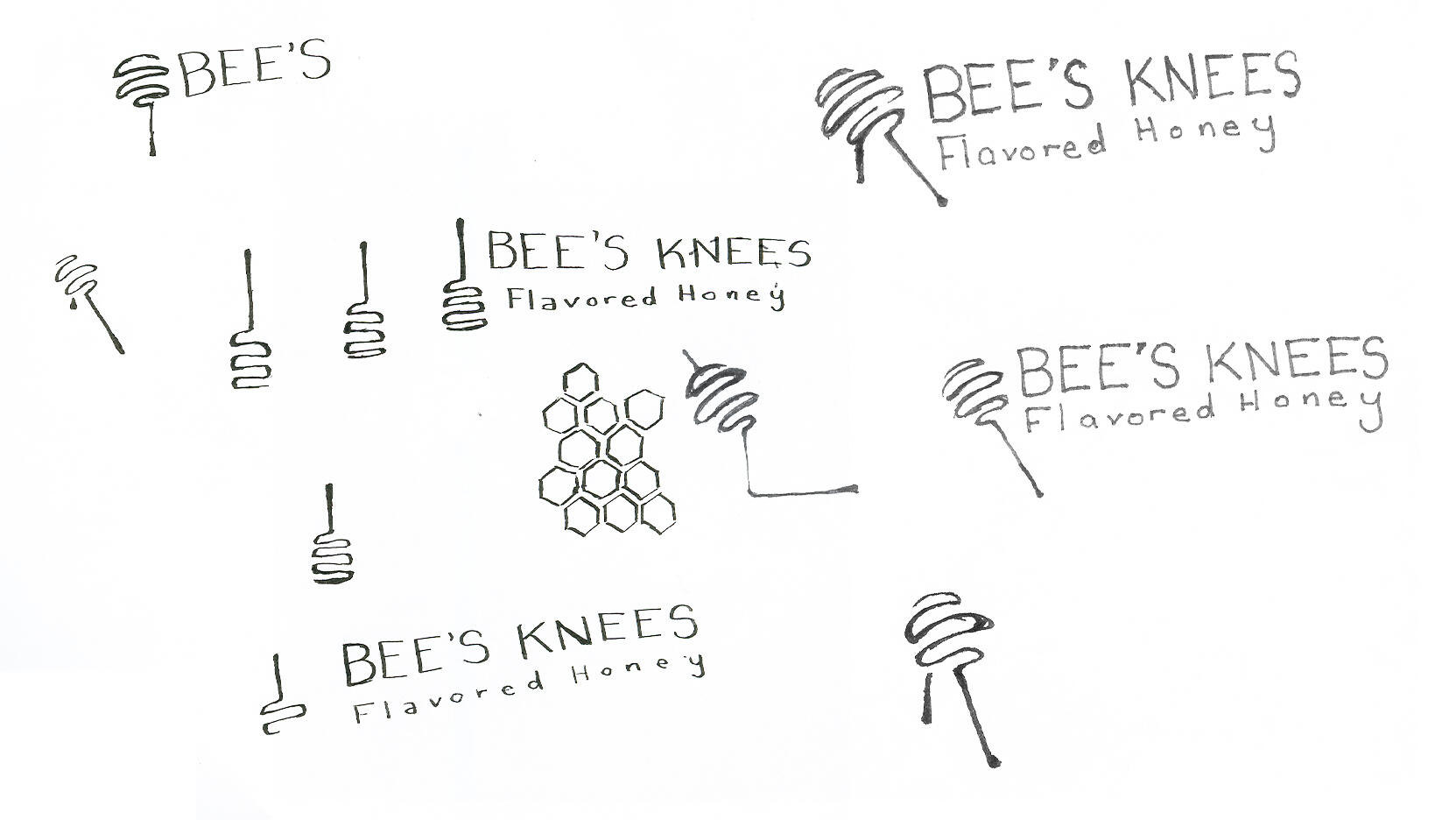
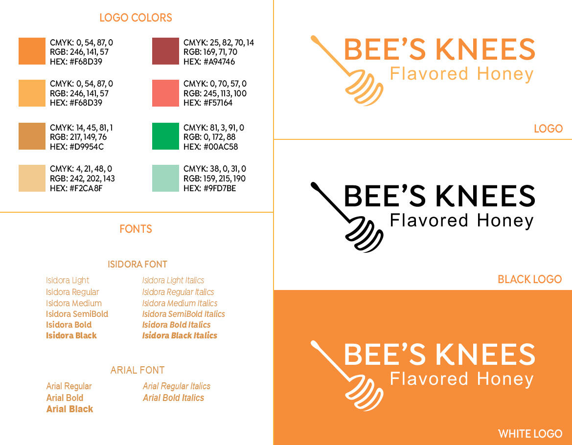
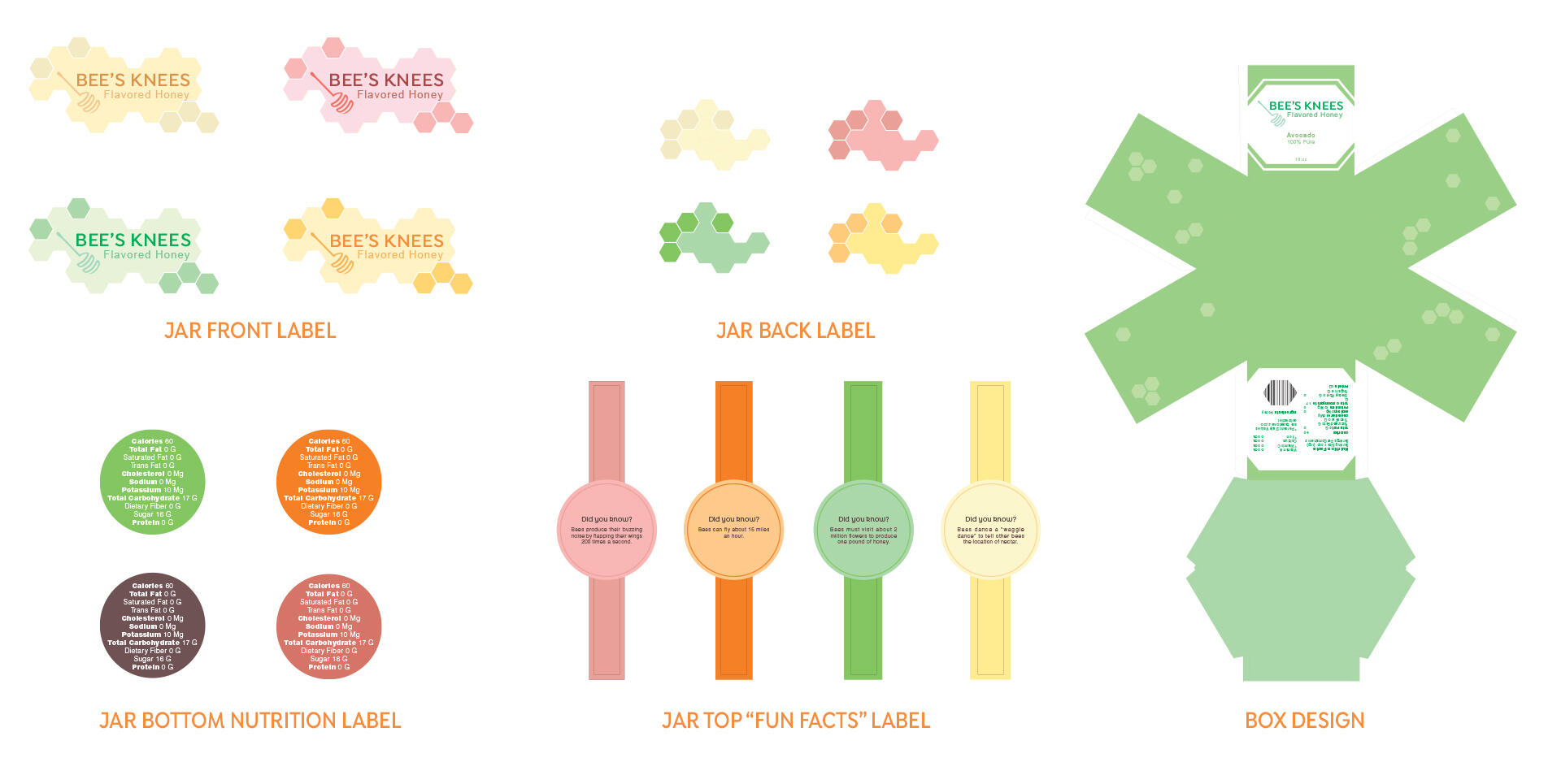
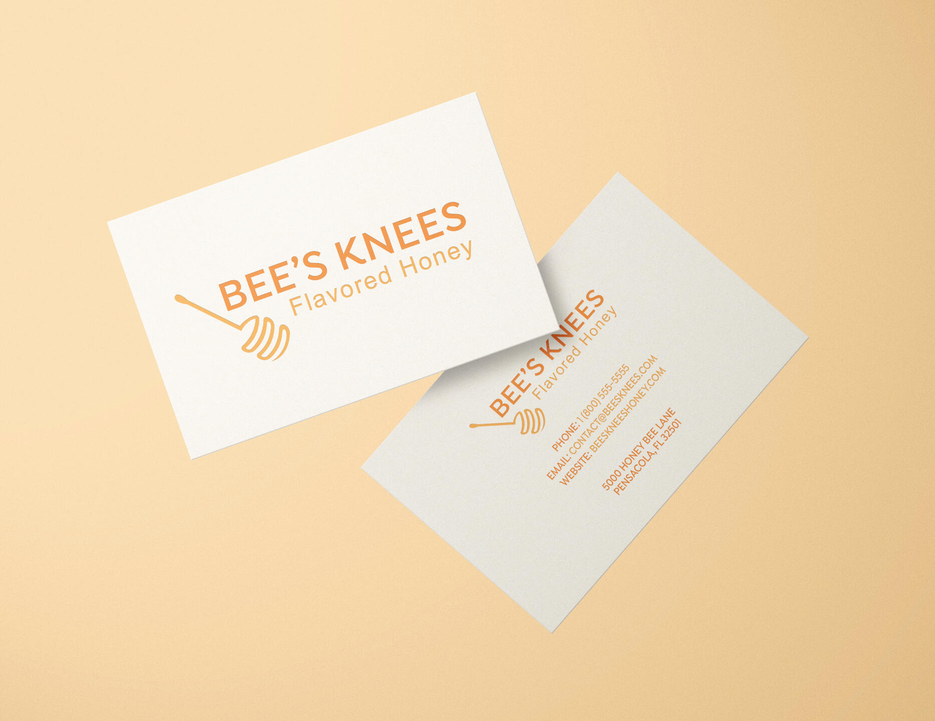
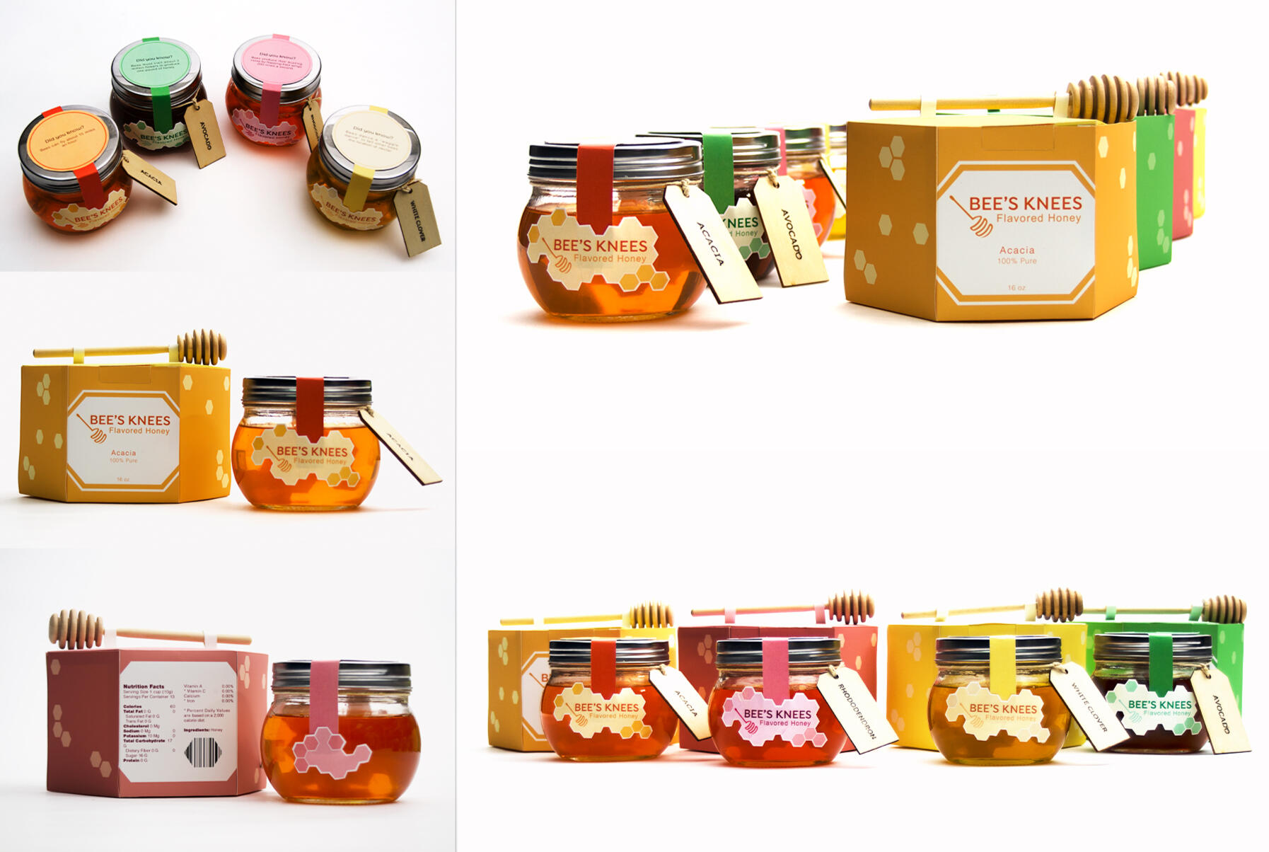
For this packaging design, I wanted to create a design that reflected the playful nature of the product name, "Bee's Knees", while also making it aesthetically appealing for consumers. Bees are some of nature's most unique and creative creatures, and I drew my main inspiration of the packaging design from common motifs of bees such as honeycomb. The logo uses the silhouette and shape of a honey dipper.

Final Product Photography

The Bee's Knees design packaging was made to be functional and attention-grabbing. The box design is hexagonal and designed to fit snugly with each other similar to a beehive, and the boxes have a handle that utilizes an actual honey dipper. Each jar has a wooden tag that has the flavor of honey burnt into it, and the label and seal that is on top of the jars contain a fun fact about bees and honey. For the product photos, I filled each jar with hand sanitizer and mixed food coloring to create the appearance of honey for the photoshoots.

Animated Bee's Knees Logo

Explore Hyrule Poster Series

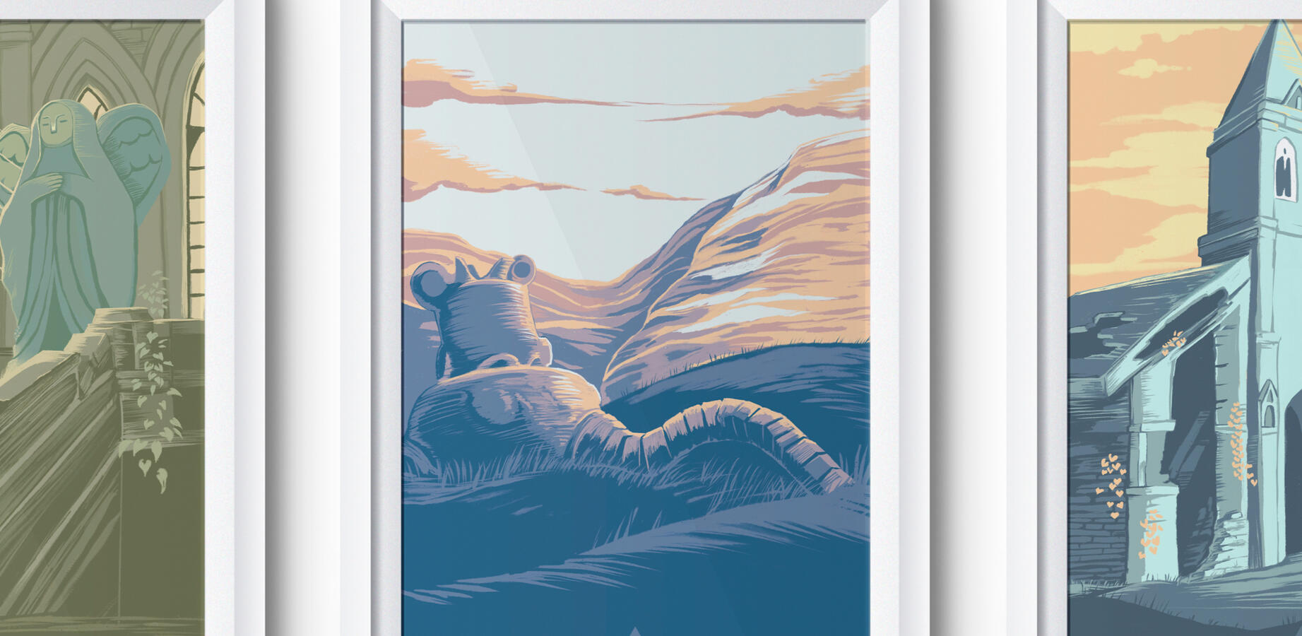
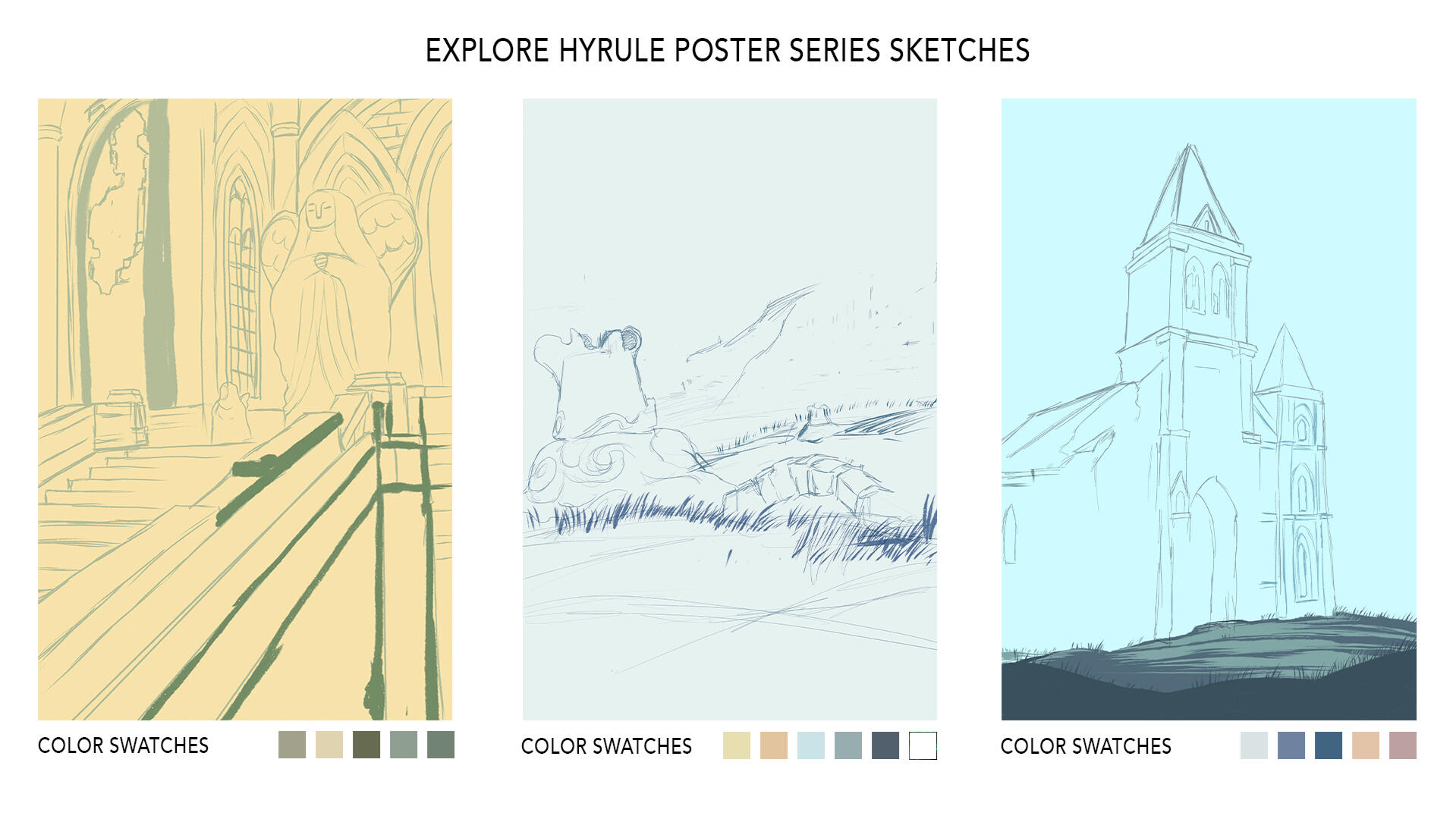
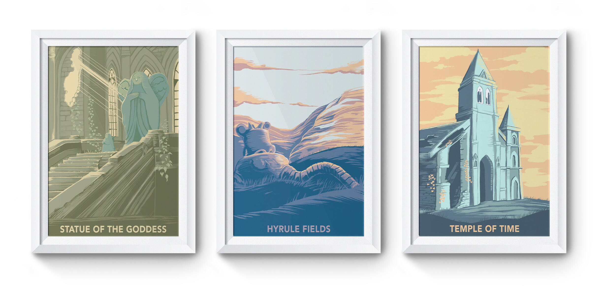
In this poster project, I combined two of my favorite things: gaming and screen-printed art. I have always admired the art style of the beautiful National Park posters and wanted to emulate the style of screen-printing to create a poster series featuring locations from one of my favorite games, "Breath of the Wild". I took screenshots of various areas in the game and then sketched out how the posters would look. I studied how screen-printed works were created before selecting color palettes containing about 5 or 6 different shades and complementary colors for each poster.

Venom Energy Drink

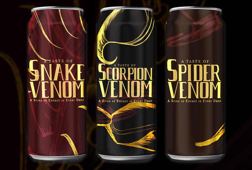
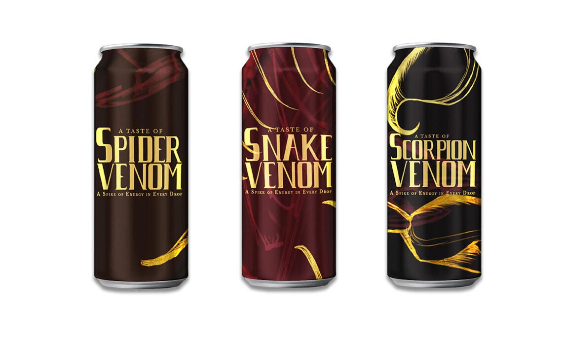
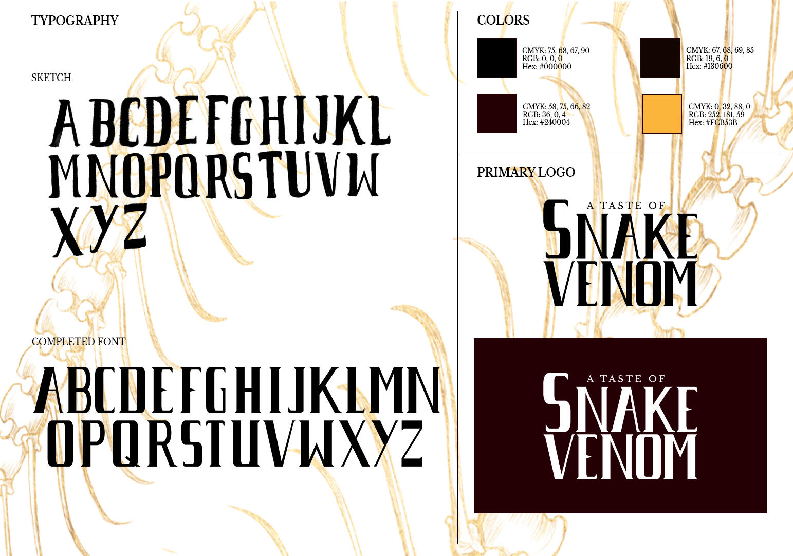
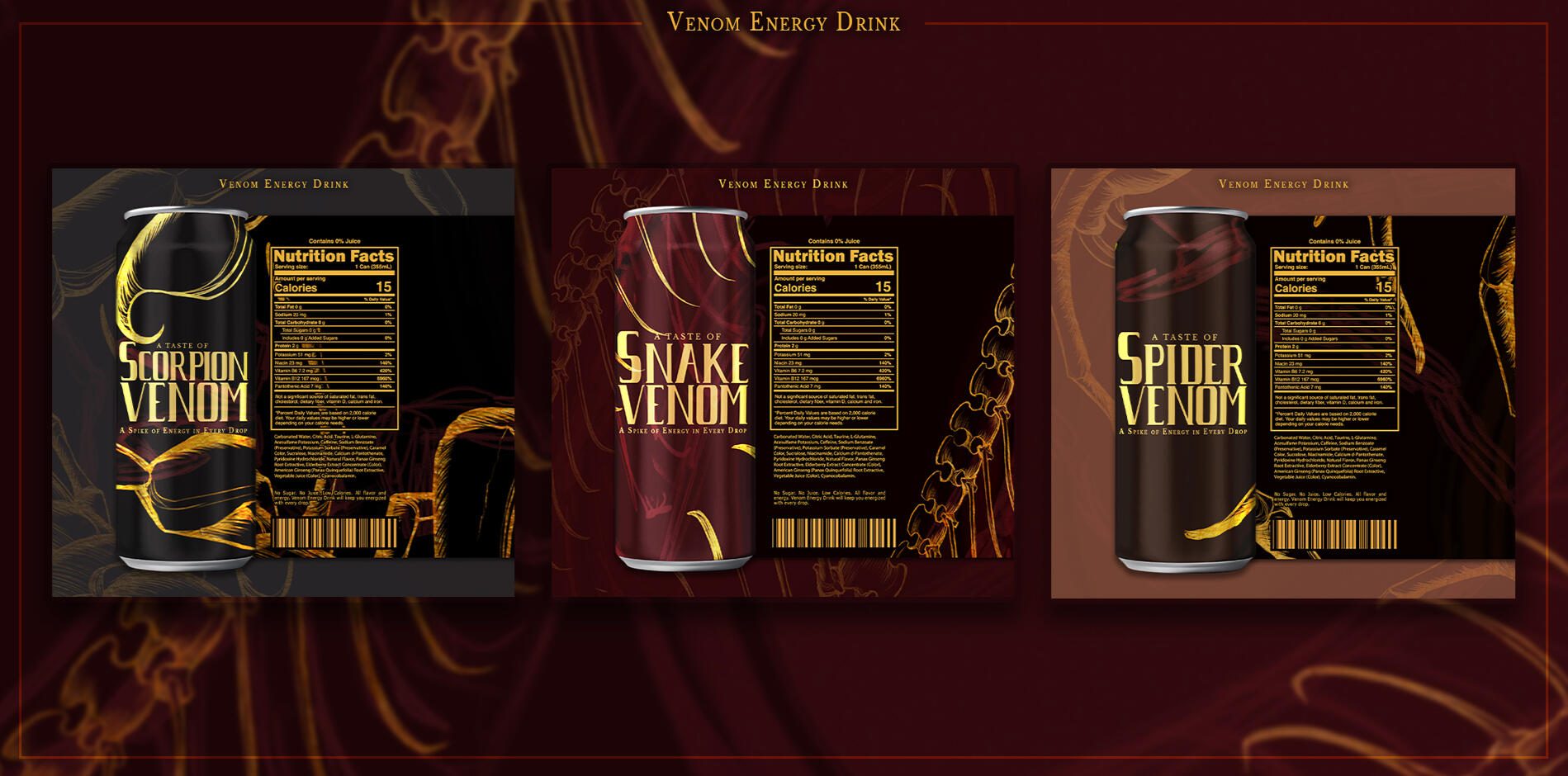
The design for Venom Energy Drink was to develop a visually impactful label that embodies the potency of the energy drink by using bold symbolism and a darker and modern aesthetic. Inspired by a snake skeleton illustration I had completed for a previous project, the branding taps into the danger of some of nature's most venomous creatures to visually convey the intensity and potency of the product. I used a dark color palette contrasted with gold accents to allow the imagery to stand out on the labels.

Logo Designs

These are various logo and brand design projects made for personal or client use. Each project begins with gathering inspiration and developing a mood board based on the client’s preferences and goals. From there, 3 to 5 rough logo sketches are created to explore visual directions. Special consideration is given to the practical applications of the logo, such as how it will appear on stationery, advertisements, decals, and other branded materials.

Superbowls & Smoothies

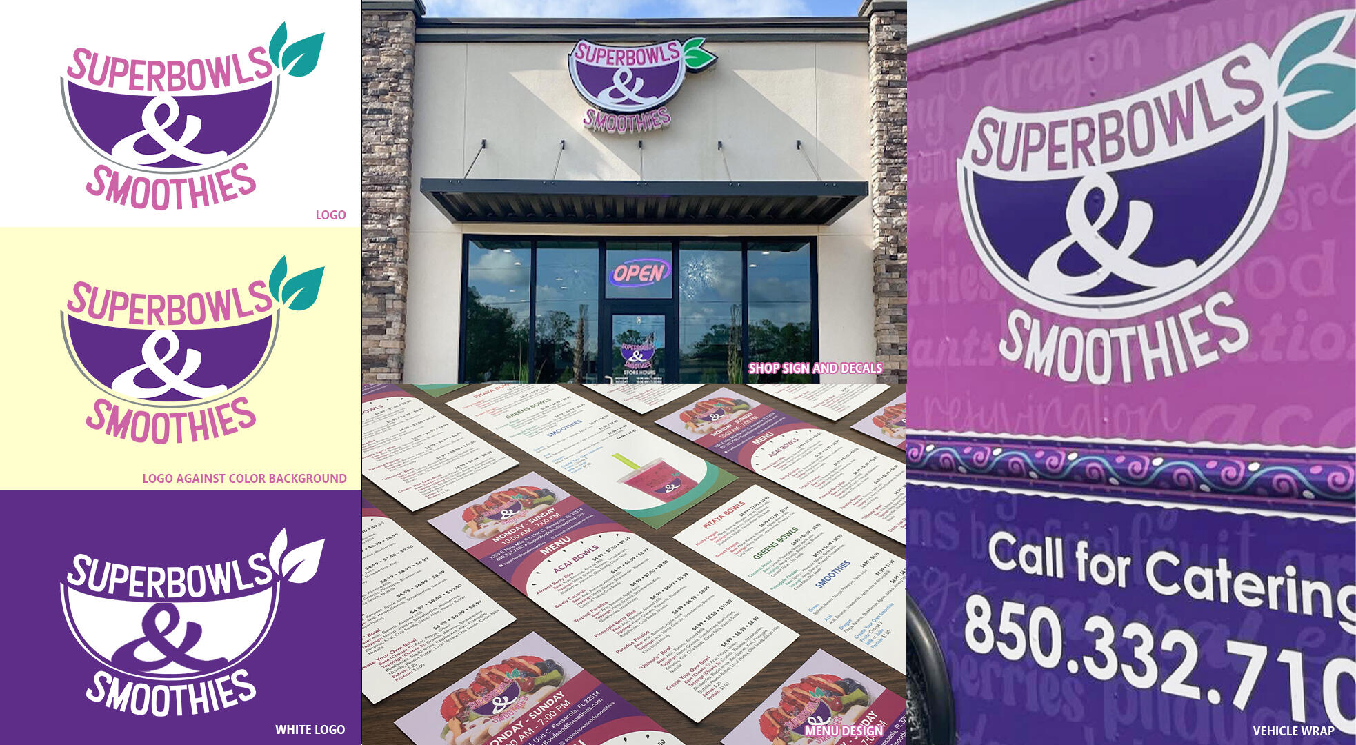
For this logo, the client requested a logo that used a specific color palette based off of photos that they sent me of their product and wanted the logo to look like a fruit and bowl while having the text integrate smoothly with the logo. After a few rough drafts, the client ultimately decided on this logo design. In addition to the logo, I created their menus and the wall decals (not pictured here) that contained a list of words pertaining to their product which was later used for their food truck wrap.

Lionfish Apparel Logo Design

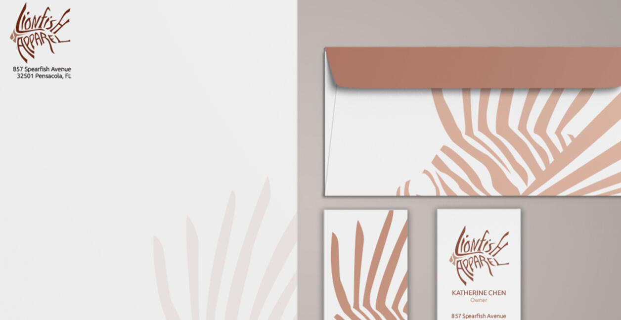
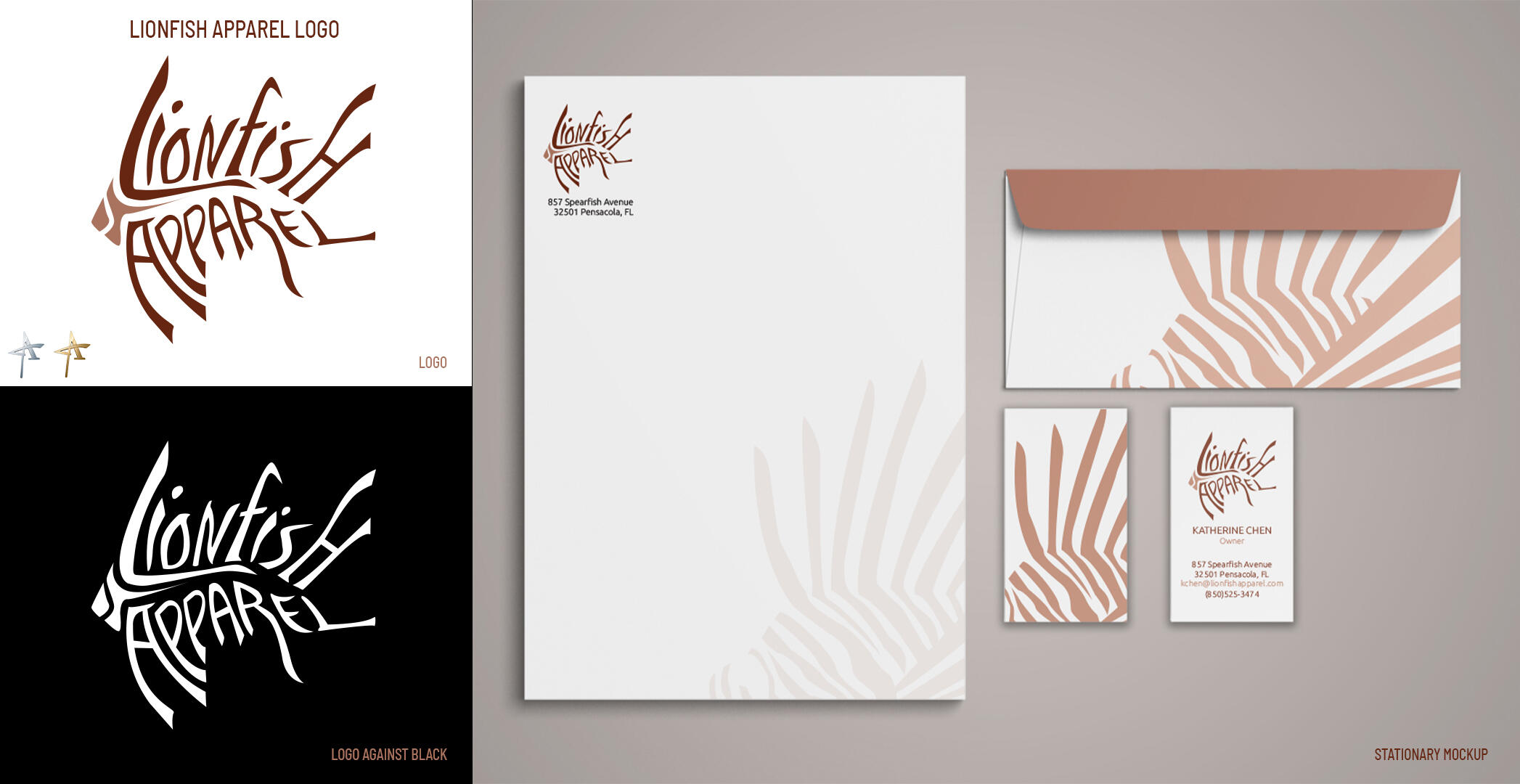
Lionfish Apparel is a personal logo that I designed to combine the distinctive shape of a lionfish with typography to create a unique and memorable visual identity of the brand. The color palette uses the colors that actual Lionfish typically sport. The logo design also won a Silver Local ADDY Award and a Gold Regional ADDY Award.

Hardley Express Trucking Logo

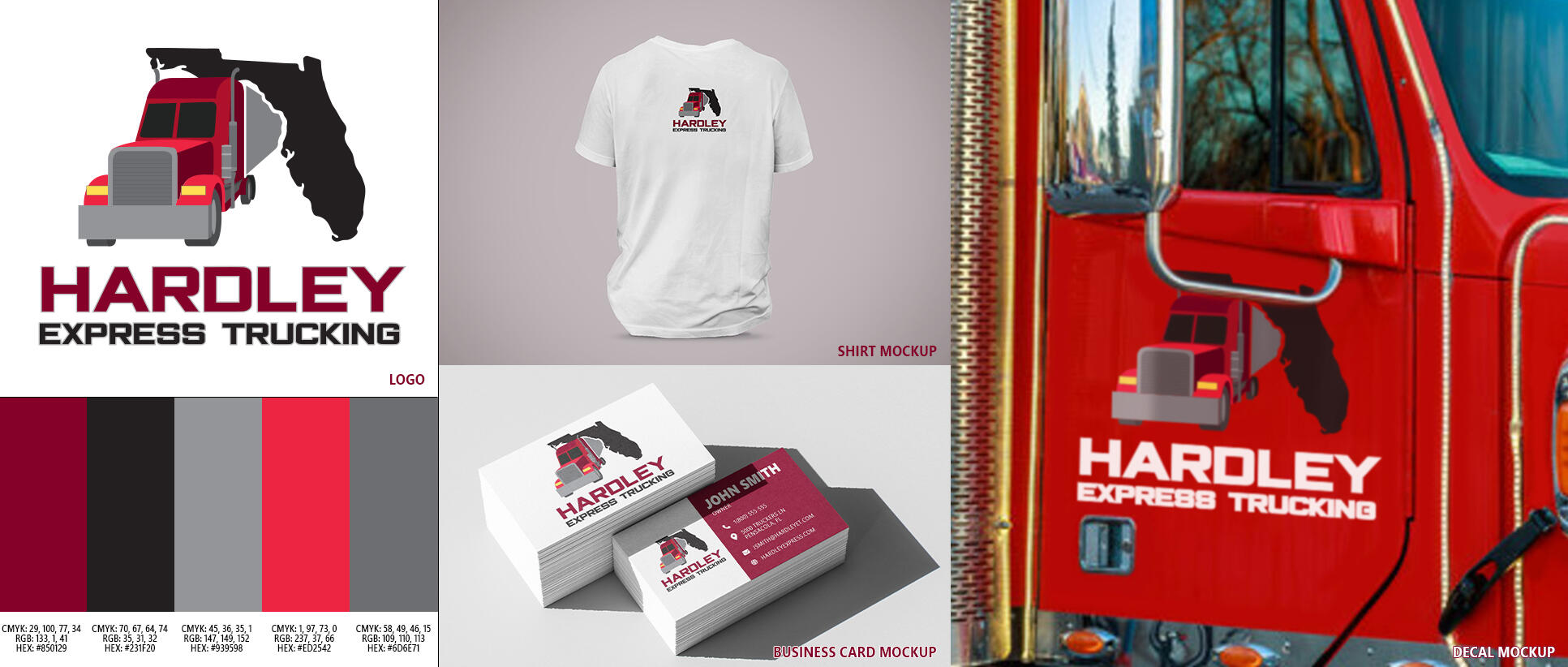
The client requested a logo based off of their red semi-truck and provided me with various photos of the vehicle. Since his private business only operated in Florida, he requested I somehow integrate the silhouette of the state to it. The logo was mainly intended to be printed as a decal for the truck, business cards, and shirts.

Apparel Design

Various examples of apparel designs that I have created for various fabrics and apparel types. I use Procreate for iPad and Adobe Illustrator to conceptualize and render the designs, and I try to make the designs high contrast and easily visible against most shirt colors.

University of Florida Gators Shirt

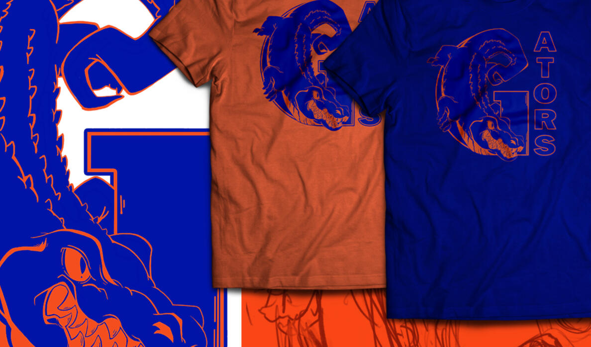
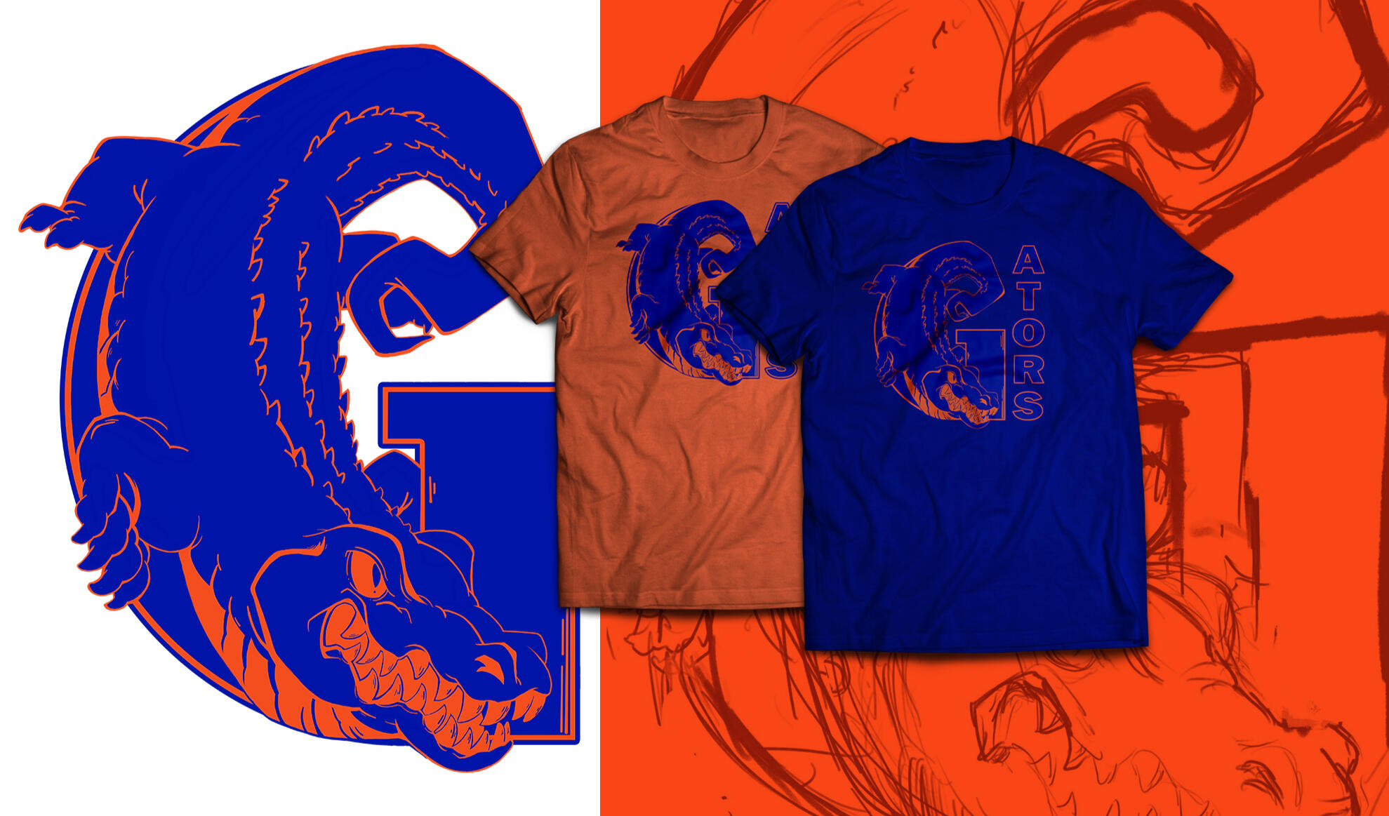
This was a shirt design I illustrated as a gift for my brother since he's an avid University of Florida Gators fan, and I wanted to give him a unique design that only he would own. I decided to create a duotone design by only using the University of Florida's blue and orange brand colors since the colors are already heavily contrasting. The design itself is meant to be printed on either blue or orange backgrounds similar to the University of Florida brand colors.

Final Fantasy XIV Shirt Design

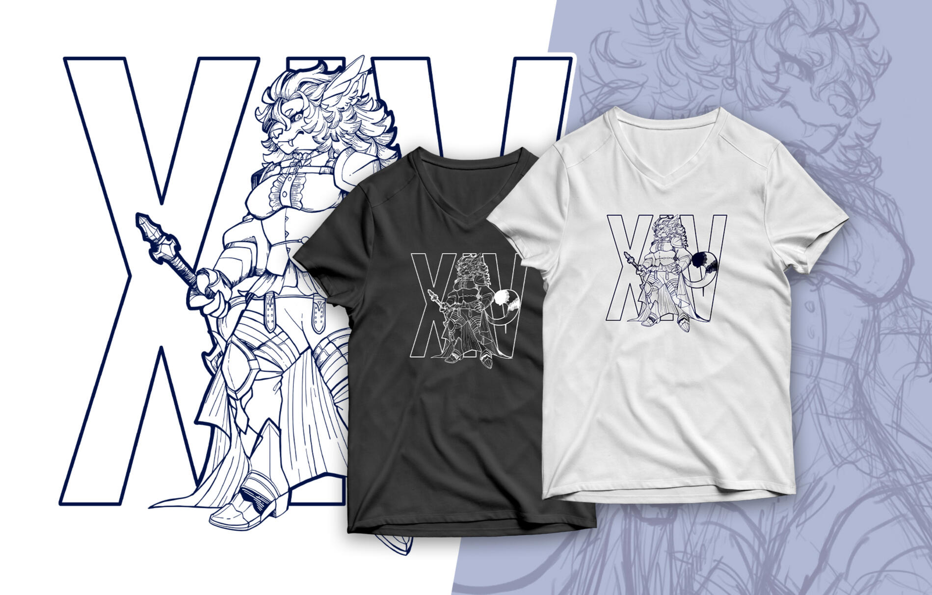
A shirt design I created for myself of my character from the game, "Final Fantasy XIV". The artwork relies on traditional shading techniques such as hatching and cross-hatching to create depth and texture without the use of color, maintaining a bold and stylized aesthetic. The single-color approach of the art ensures that the design can be printed across a wide range of fabric tones.

Other Design Examples

These are other graphic design examples made for personal and client use. These designs are older than the other designs showcased in my portfolio, however these are personally some of my favorite projects that I felt were the most impactful in my career.

Energy-efficient Poster

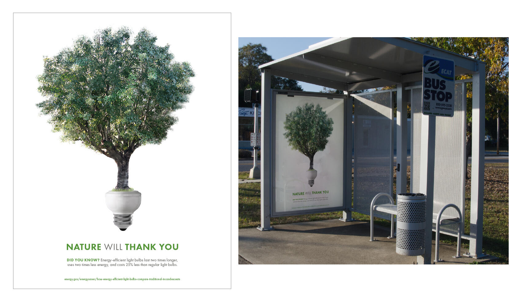
This electricity conservation awareness poster was created for a student project and made during the energy-efficient LED lightbulb trend. The design features a stock photo of a lightbulb that I photo-edited and merged with a photograph of a tree that was taken in my parents’ front yard and meant to symbolize the connection between sustainability and everyday appliances.

Quickly Window Perforation

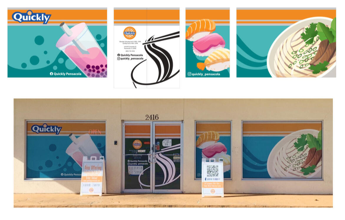
Window perforations that I designed for the local Quickly restaurant in Pensacola, FL. The client had requested the window perforations be 'family friendly' while advertising the main dishes they served (sushi, pho, and boba tea). The client requested that I left the orange and gray bar at the top for extra signage such as the LED Open sign. The design utilizes bright and more pastel colors to give the restaurant a more 'playful' and welcoming appearance to appeal to customers of all ages.

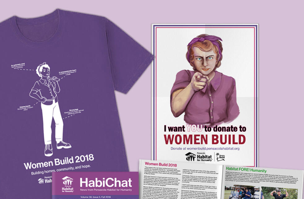
Women Build 2018

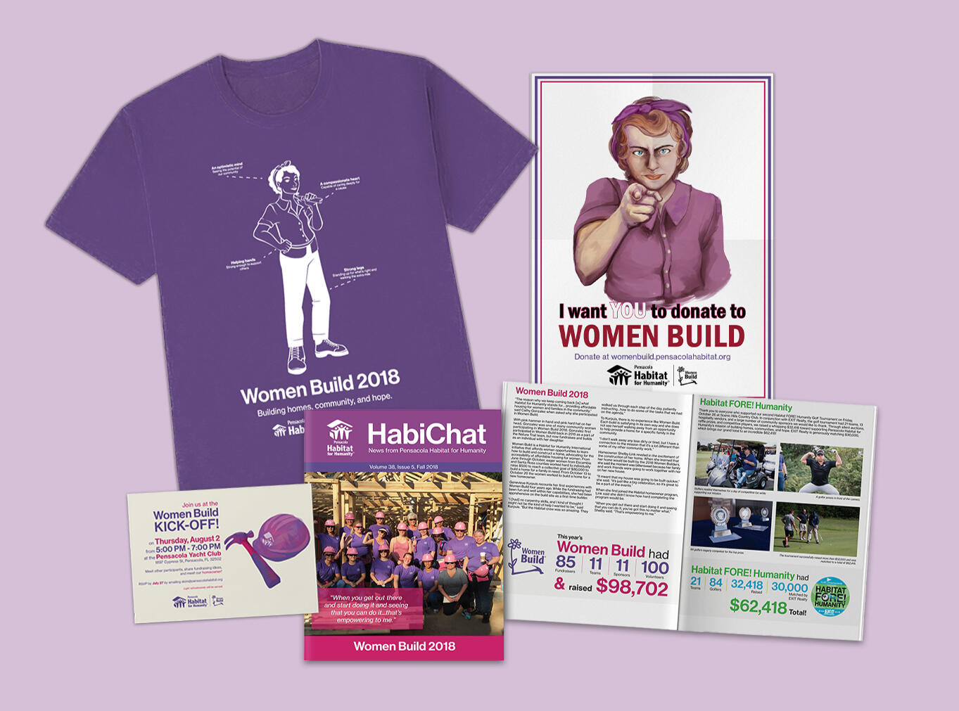
Marketing materials and newsletter designs that I created for the Pensacola Habitat for Humanity Women Build 2018 volunteer group. I redesigned the newsletter to have better readability and formatted it to allow room for more photographs and longer articles. Part of my role was to edit and format the newsletter bi-monthly and prepare it for print and online viewing to an audience of over 4000 readers. The poster design features the Women Build volunteer group's mascot, Rosie the Riveter, in the same pose as the classic and retro Uncle Sam poster while encouraging people to donate to the cause. The design for Rosie was more inspired by Norman Rockwell's version of Rosie while wearing the pink and purple colors of Women Build.